```{r setup, include=FALSE}
knitr::opts_chunk$set(echo = TRUE)
#handy package manager that installs and loads packages used in this document
if (!("pacman" %in% installed.packages()[,"Package"])) { install.packages("pacman") }
pacman::p_load(dplyr, tidyr, ggplot2, GGally, Rmisc, jtools, psych, prettydoc) #install (if needed) and load packages
```
# Why does a plotting package have grammar?
While it may sound strange, understanding the *grammar* of the `ggplot2` package is fundamental to being able to use it effectively. Grammar refers to the syntactic rules of a language that can be combined with a variety of substantive material. Grammar or syntax provide the structure of _how_ language can be expressed.
In other words, the grammar of `ggplot2` is provides the _rules_ of how to write code to give us a beautiful graph as the output. Importantly, other ways of creating graphics have syntax as well (including Excel and SPSS), but `ggplot` is slightly different.
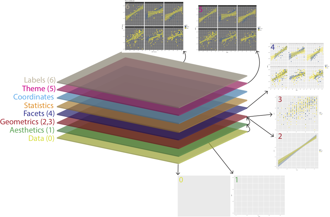
_Layering_ is a key concept in plotting with the `ggplot2` package. That is, `ggplot2` attempts to move users away from thinking about point and click interfaces that produce one single graphic. Instead, the hope is to give users the freedom to think about the graphics they would like to create in a highly customizable framework. In the references below, you'll see a link to the "R Graphics Cookbook", which should further one's intuition that `ggplot2` has the desirable property of allowing users to use more modular pieces of code to create beautiful plots exactly to the user's specification.
# Layering in ggplot
We'll work quickly through an example, which will end with the basic layers added to make this plot:
```{r warning=FALSE, echo =FALSE, message=FALSE}
sat.act <- get(data(sat.act)) %>% dplyr::filter(ACT >10) #the get command here simply retreives the data itself from the psych package and places the sat.act data.frame into the R environment
sat.act$gender <- factor(sat.act$gender, levels = c(1,2), labels = c("Female", "Male")) #assuming gender is treated as binary, not the best assumption but bear with
gg_verbal_object <- ggplot(data = sat.act, aes(x = ACT, y = SATV, color = gender, fill = gender)) + geom_point() + scale_color_viridis_d(begin = .3, end = 1) + scale_fill_viridis_d(begin = .3) + geom_smooth(method = lm) + facet_wrap(~education) + theme_dark() + labs(x = "ACT scores", y = "SAT Verbal", title = "This is a pretty plot")
plot(gg_verbal_object)
```
When we talk about layers in ggplot, we're talking about creating a graphic from scratch by stacking layers on top of one another, like such:
```{r label, eval=FALSE, out.width = "100%", fig.cap = "inspired by [this website](https://skillgaze.com/2017/10/31/understanding-different-visualization-layers-of-ggplot/).", echo=FALSE}
knitr::include_graphics("ggplot_layers.pdf")
```
{width=100%}
\n
In other words, without understanding how one stacks layers in a ggplot object we will never get to the above plot. Instead we start from scratch with the raw data, which looks like this:
```{r}
str(sat.act); head(sat.act)
```
## Creating a base ggplot object
If we ran blindly into creating the above graph we might want to run a command that says:
\n\n
```
Plot my data please!!
```
Okay, then... here we go:
```{r}
gg_object <- ggplot(data = sat.act)
plot(gg_object)
```
...womp.
\
\
What happened here is that we set up a ggplot object but have told it what to do with the data yet, it's sitting there but R does not know how you want it so it will kick back a blank screen. We can think of this as our plotting "canvas"
Oh right, let's run a command that says:
\
```
Plot my data please, and this time include ACT score on the x axis and
verbal SAT scores on the y axis!! Also, let's visually separate the
data for males and females.
```
\
In this case, we can simply _add_ aesthetic mappings to the x and y axis so the `gg_object` now knows what variables from the data.frame to plot on x and y and that males and females should be colored differently:
```{r}
#don't worry about the difference between color and fill for now
gg_object_aes <- ggplot(data = sat.act,
aes(x = ACT, y = SATV, color = gender, fill = gender))
plot(gg_object_aes)
```
\
\
Now we have x and y axes specified that correspond to in the `aes()` argument. This is what many would consider the base of a `ggplot` object that we can now layer on top of. We still can't see our data, however. In order to do so, we need to add a `geom_` layer to the plot.
## Geometric layers
To actually see your data in geometric space we need to tell `ggplot` how to visualize our data. You can look on the online [documentation](https://ggplot2.tidyverse.org/reference/) for what might work best. In basic regression one of the best ways to look at the dependence of one variable on another, often a scatter plot with a regression line fit to the data.
We can pass this to R by including the `geom_point()` and `geom_smooth`command.
```{r}
gg_object_aes <- gg_object_aes + geom_point() + geom_smooth(method = lm) + scale_color_viridis_d(begin = .3, end = 1) + scale_fill_viridis_d(begin = .3) #no need to worry about the viridis calls for now
plot(gg_object_aes)
```
## Facets
The `facet_wrap()` and `facet_grid()` functions can split the data further into additional panels on the basis of a factor (categorical variable). This will yield a set of 'small multiple' plots in which each panel represents the same graphical idiom, but with data from a different level of the faceting variable.
For example, if we wanted different panels in our scatter plots to correspond to different levels of education, we could add:
```{r}
gg_object_aes <- gg_object_aes + facet_wrap(~education)
plot(gg_object_aes)
```
## Themes
To add a different aesthetic touch (for example, the yellow is kindof tough to see on the white background), there are different "themes" that are built in or included in the `prettydoc` (this .Rmd) package. One that I often use is `gg_object + theme_bw()`, which is a simple black and white background with tickmarks that seem reasonable. Anyways, given the yellow on white problem, let's plot this using a dark background.
N.B. This is not the only way to solve this problem, it is just as easy to change the colors of your data points.
```{r}
gg_object_aes <- gg_object_aes+ theme_dark()
plot(gg_object_aes)
```
## Labels
We'll finish up by changing the labels of the x and y axis and the main title using the `labs()` function.
```{r}
gg_object_aes <- gg_object_aes +
labs(x = "ACT scores", y = "SAT Verbal",
title = "This is a pretty plot", subtitle = "And also I'm done talking"
)
plot(gg_object_aes)
```
And we're back to where we started, yet we've constructed this plot layer-by-layer and hopefully we have a bit more of an understanding for what the `ggplot2` package is capable.
\
\
To bring things full circle there is also the option to throw this all into one command from the beginning:
```{r}
gg_verbal_object <- ggplot(data = sat.act, aes(x = ACT, y = SATV, color = gender, fill = gender)) +
geom_point() + scale_color_viridis_d(begin = .3, end = 1) +
scale_fill_viridis_d(begin = .3) + geom_smooth(method = lm) +
facet_wrap(~education) + theme_dark() +
labs(x = "ACT scores", y = "SAT Verbal", title = "This is a pretty plot")
```
There is plenty more that I haven't included, but here are some resources for you to consult as you embark on your journey into the soul of `ggplot`!
## Useful Resources
In order from easiest to use through the more conceptual.
[ggplot cheatsheet](https://www.rstudio.com/wp-content/uploads/2015/03/ggplot2-cheatsheet.pdf)
[R Graphics Cookbook (Chang)](http://users.metu.edu.tr/ozancan/R%20Graphics%20Cookbook.pdf)
[R for Data Science Book (Wickham)](https://r4ds.had.co.nz/data-visualisation.html)
[A Layered Grammar of Graphics (Wickham)](http://vita.had.co.nz/papers/layered-grammar.pdf)