Communicating uncertainty and risk

2025-02-27

Rick Gilmore

Overview

In the news

Figure 1 from Dwyer-Lindgren et al. (2024)
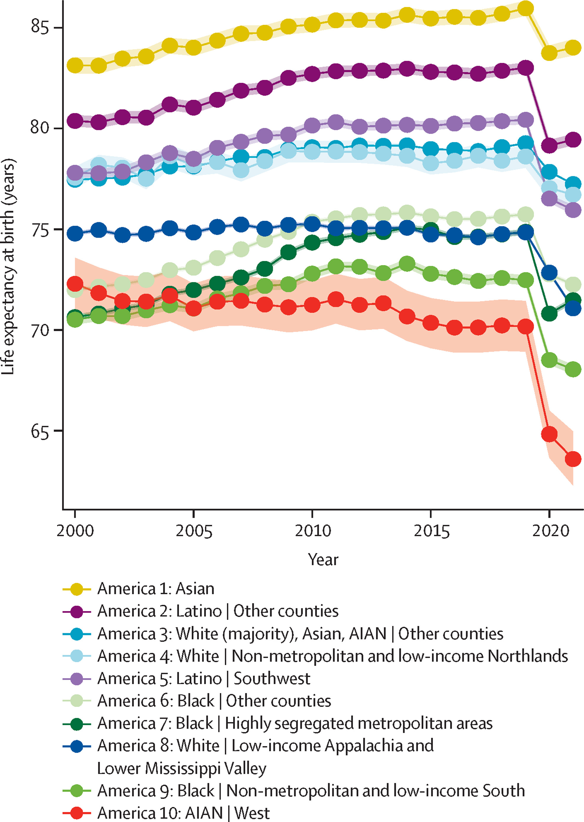
Figure 1 from Dwyer-Lindgren et al. (2024)

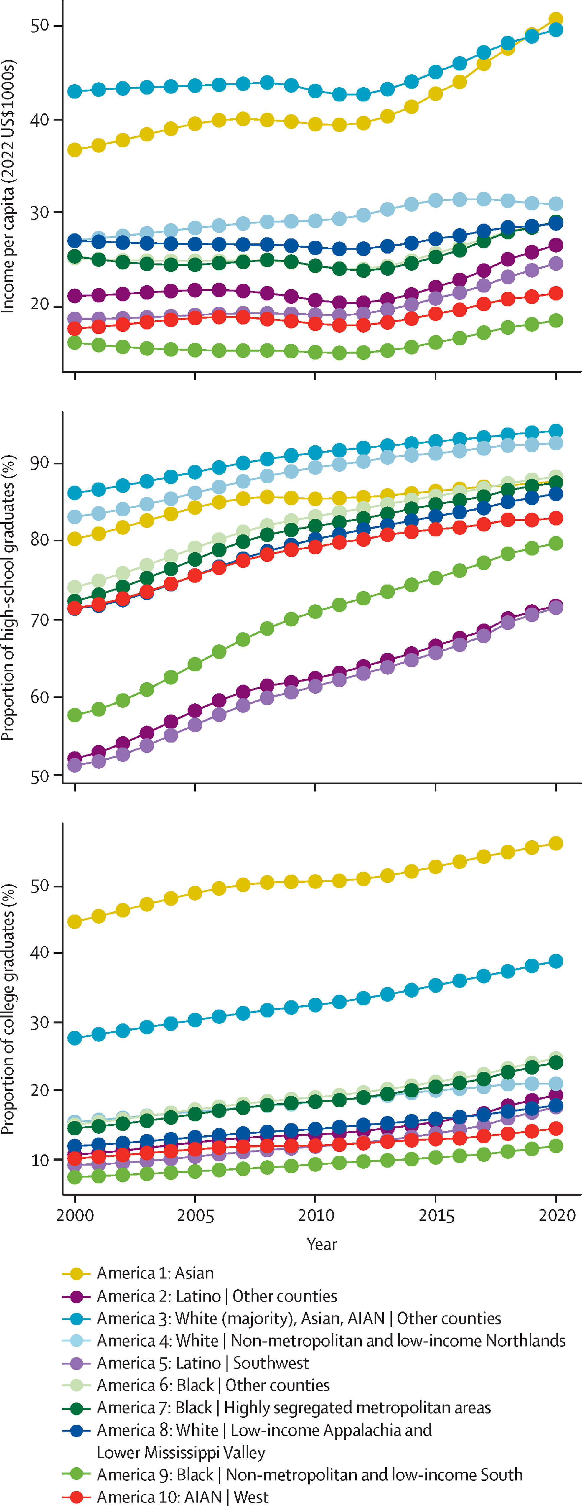
Figure 4 from Dwyer-Lindgren et al. (2024)

Figure 4 from Dwyer-Lindgren et al. (2024)

Announcements

Available through March 2

Last time…

  • Introduction to R
    • Introducing DataCamp

Today

  • Communicating uncertainty and risk
  • Work session
    • R (DataCamp)
    • Exercise 04
    • Final project proposal

Communicating uncertainty and risk

Let’s make some data

Code
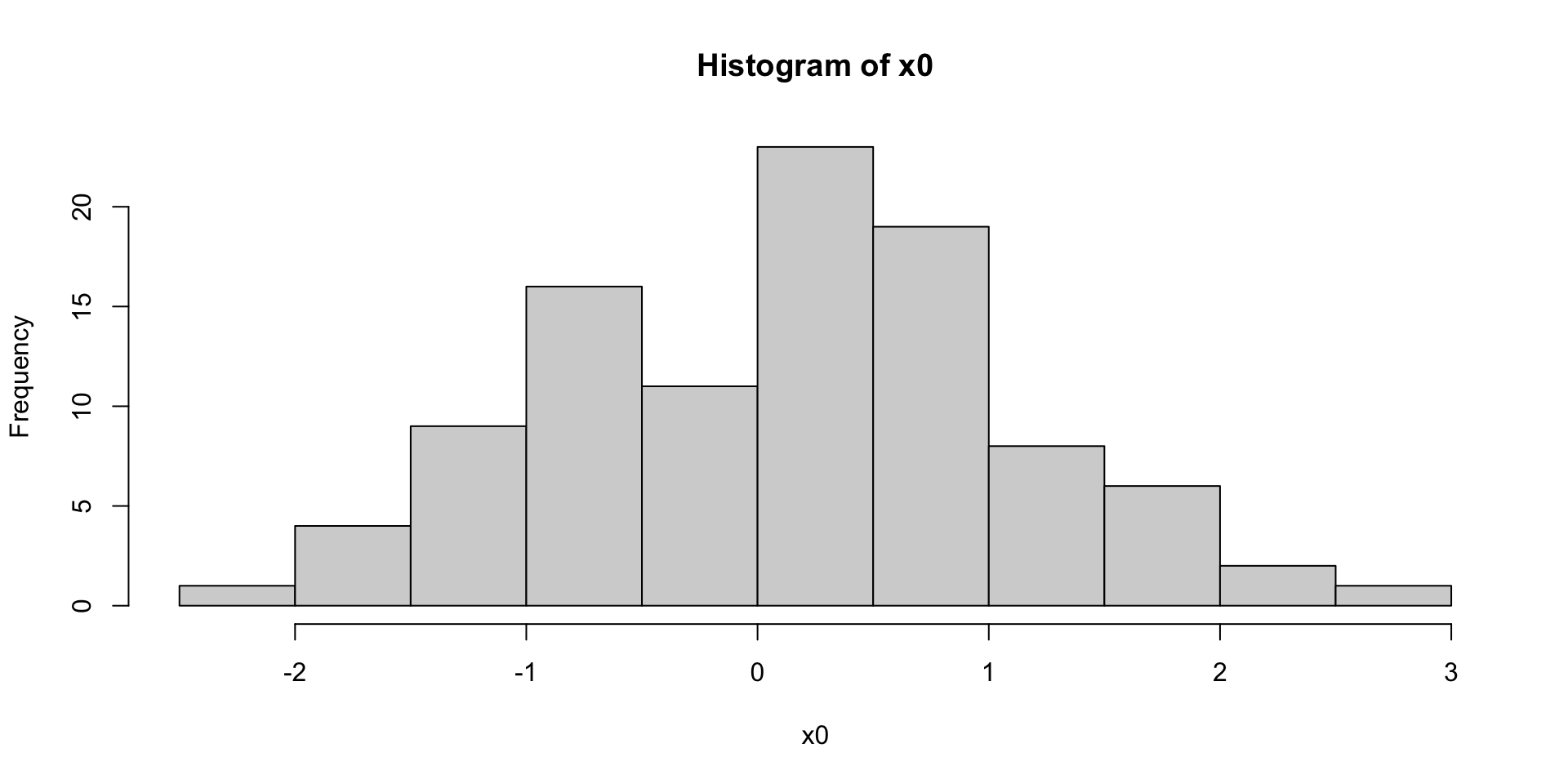
x0 <- rnorm(n = 100, mean = 0, sd = 1) # Normal distribution with mean 0 and standard deviation 1
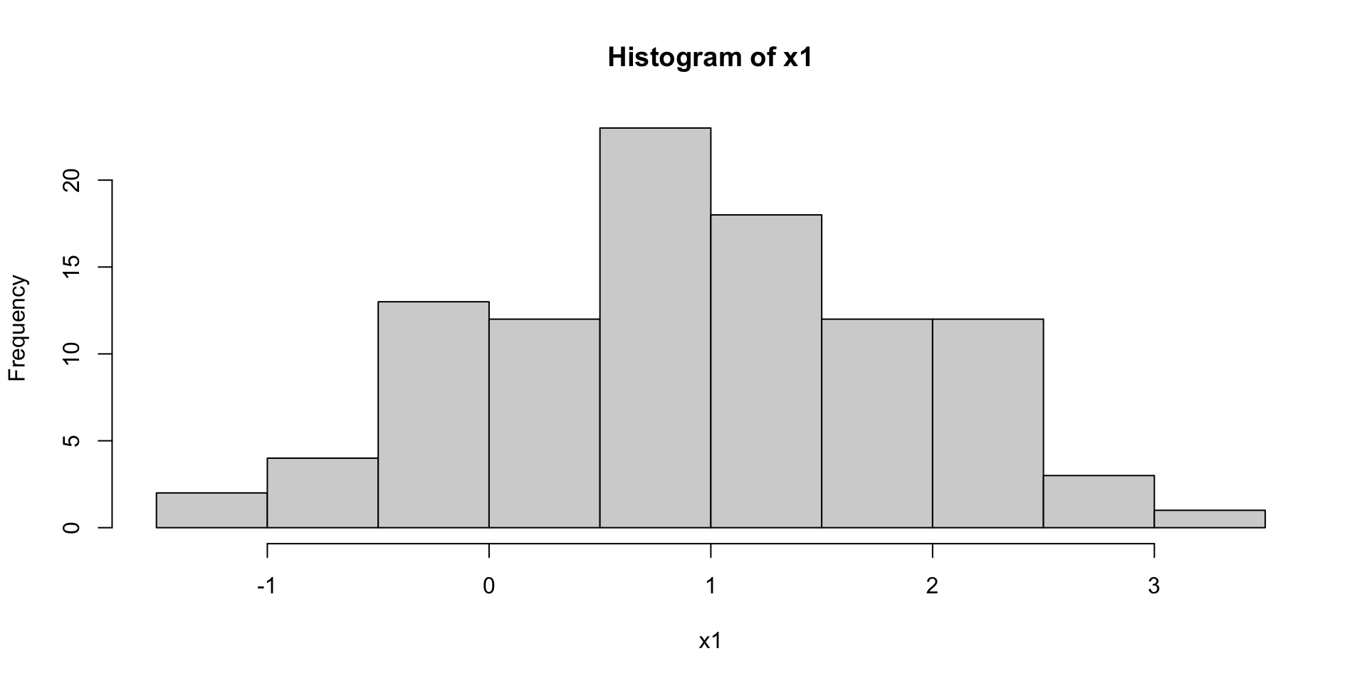
x1 <- rnorm(n = 100, mean = 1, sd = 1) # Normal distribution with mean 1 and standard deviation 1

Plot the data

Code
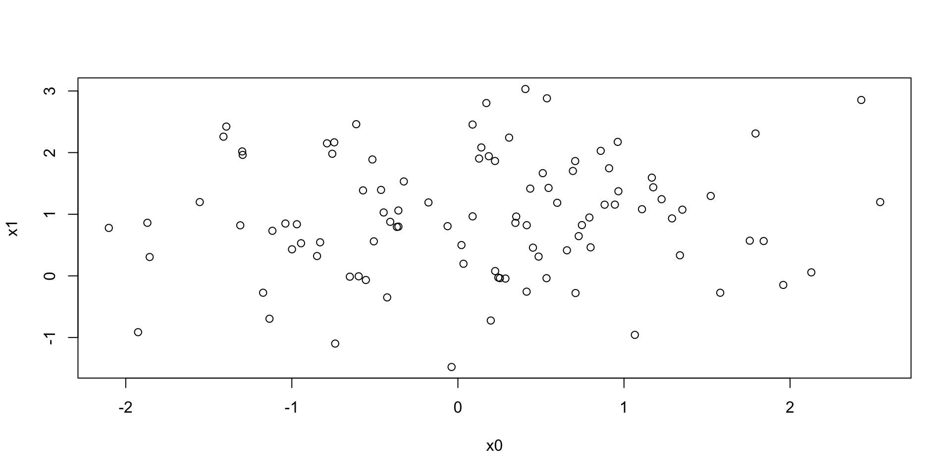
plot(x0, x1)

Figure 1

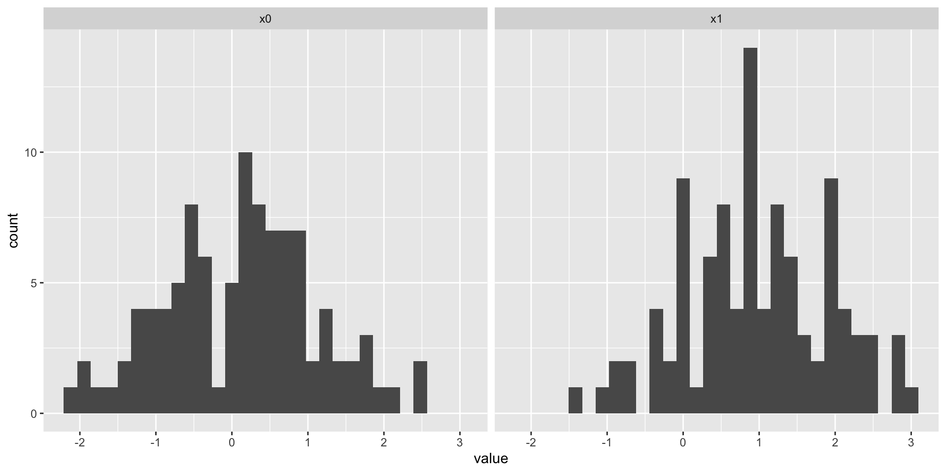
Histograms

Code
hist(x0)
Figure 2: Histogram of X0 with mean 0
Code
hist(x1)
Figure 3: Histogram of X1 with mean 1

Let’s ‘tidy’-up

  • “Tidy” data \(\rightarrow\) rectangular data; columns are variables; rows are observations.
  • A data frame (data.frame()) is a useful way to store tidy data
Code
two_sets <- data.frame(sample_name = c(rep("x0", 100), 
                                       rep("x1", 100)), 
                                       value = c(x0, x1))

dim(two_sets) # What is the dimension (size) of two_sets?
[1] 200   2
Code
readr::write_csv(two_sets, "../include/csv/two_sets_1_sd.csv")
Code
head(two_sets) # first several rows
  sample_name      value
1          x0 -0.2215727
2          x0  0.7239627
3          x0  1.0537225
4          x0  1.4285979
5          x0 -2.1792573
6          x0 -1.0780997
Code
tail(two_sets) # last several rows
    sample_name      value
195          x1 -0.5821572
196          x1 -0.2016177
197          x1  0.9861709
198          x1 -0.5459307
199          x1  0.9408583
200          x1  1.6810159

Note

data.frame(): makes a rectangular table of data with labeled columns.

rep(): replicates or repeats its arguments. So rep('x0', 100) makes a vector/array with 100 copies of ‘x0’.

We use value = c(x0, x1) to combine x0 and x1 into one long set of values.

Wait!: You said don’t use the equal sign (=), but use it here. What gives? Long-story shortened: The equal sign (=) only works when we’re defining parameters inside a function; the left arrow (<-) does not. So, use left arrows for assigning names outside a function and equal signs inside functions.

Syntax is kind of a pain. Remember when you had to learn English grammar?

Another way to plot
Boxplot + violin + raw
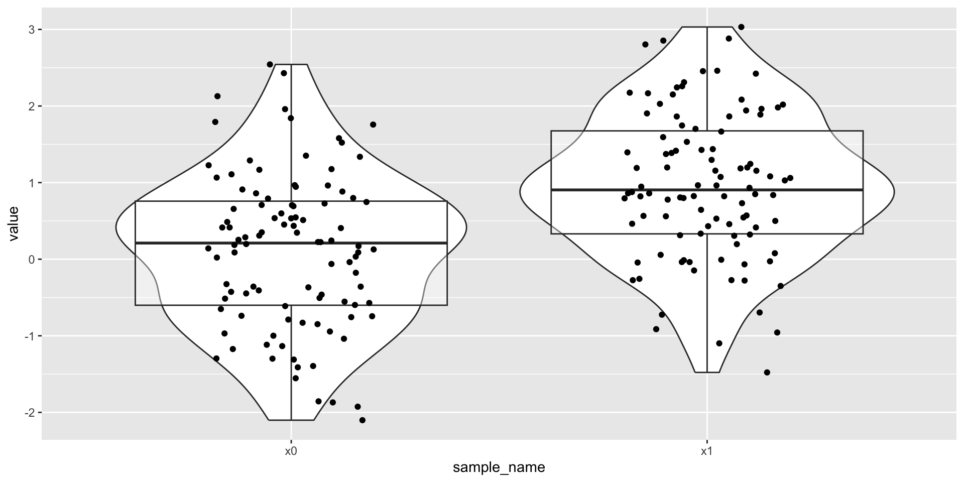
Code
two_sets |>
  ggplot() +
  aes(x = sample_name, y = value) +
  geom_violin() +
  geom_boxplot(alpha = .4) +
  geom_jitter(width = .2, height = 0)

Figure 4

Points + error bars

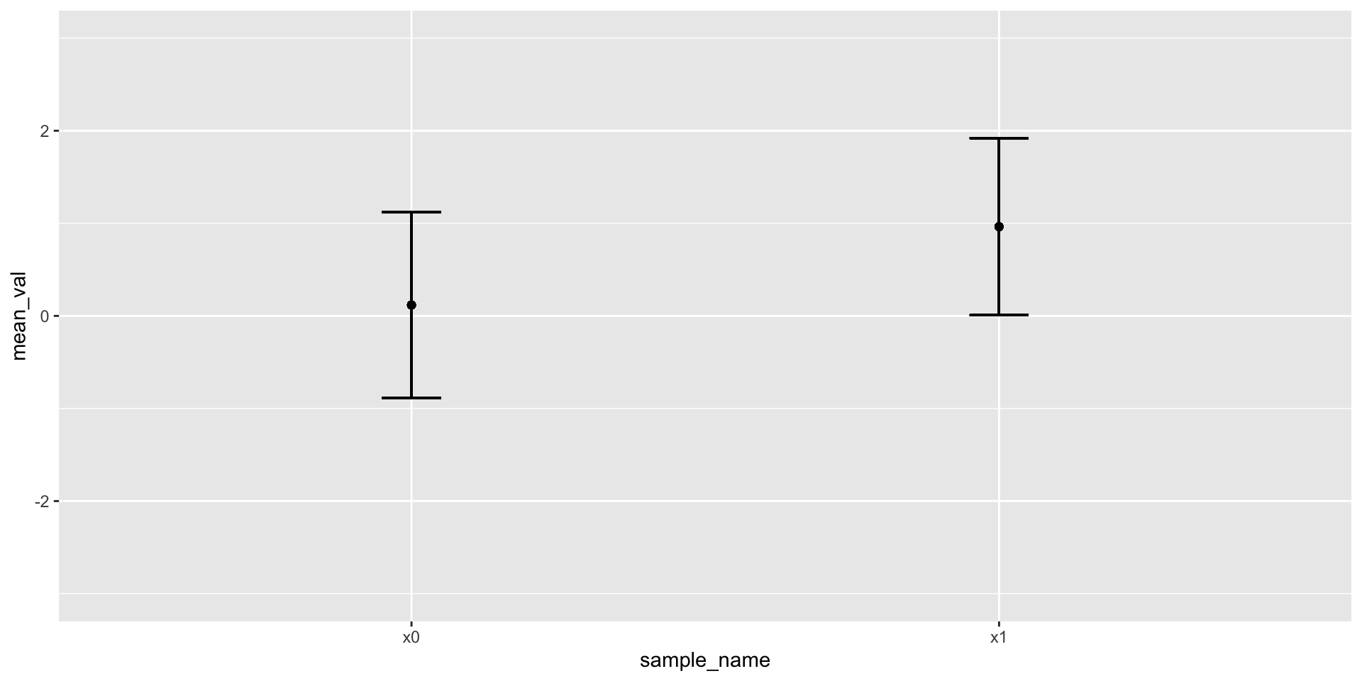
Figure 5: Mean + 1 standard deviation
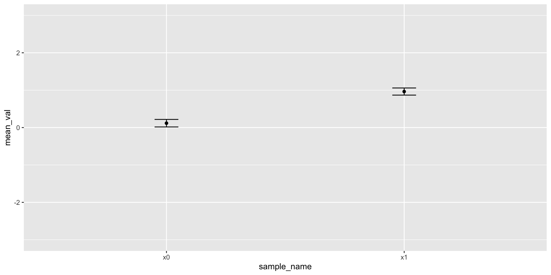
Figure 6: Mean + 1 standard error of the mean
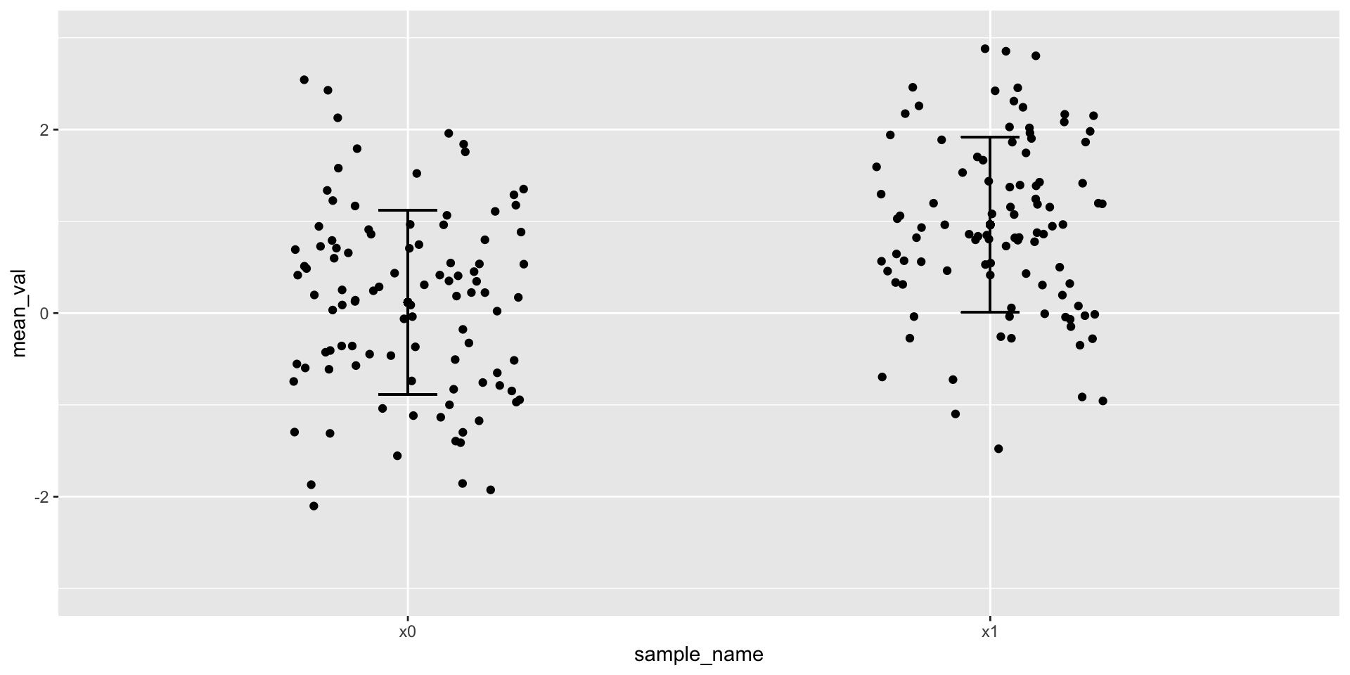
Figure 7: Mean + 1 standard deviation + jittered points
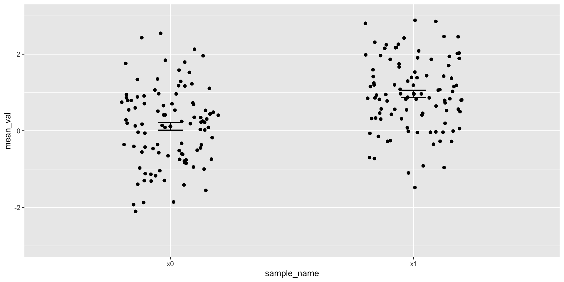
Figure 8: Mean + 1 standard error of the mean + jittered points

Visualizing relationships between variables

  • \(y=F(x) + error\)
  • e.g., shoe_size = F(height)
  • Make data that are related to one another
  • Can we see the relationship?
Code
x <- runif(n = 100, min = 0, max = 1) # Uniform distribution with min 0 and max 1
e <- rnorm(n = 100, mean = 0, sd = 1)
y1 <- x + 0.5*e
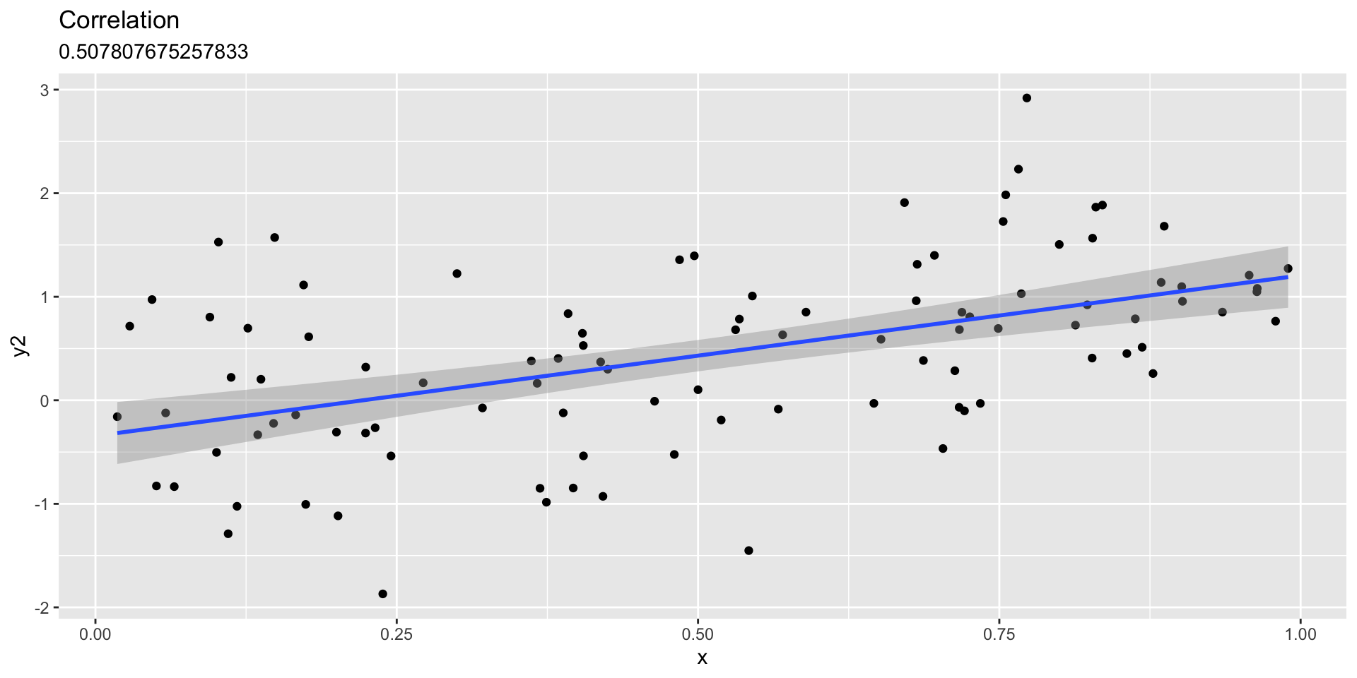
y2 <- x + 0.75*e
y3 <- x + e
y4 <- x + 1.5*e
y5 <- e

linear_df <- data.frame(x = x, y1 = y1, y2 = y2, y3 = y3, y4 = y4)

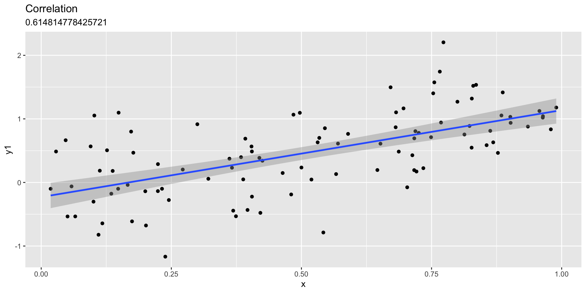
Linear fit with sd=.5

Linear fit with sd=.75
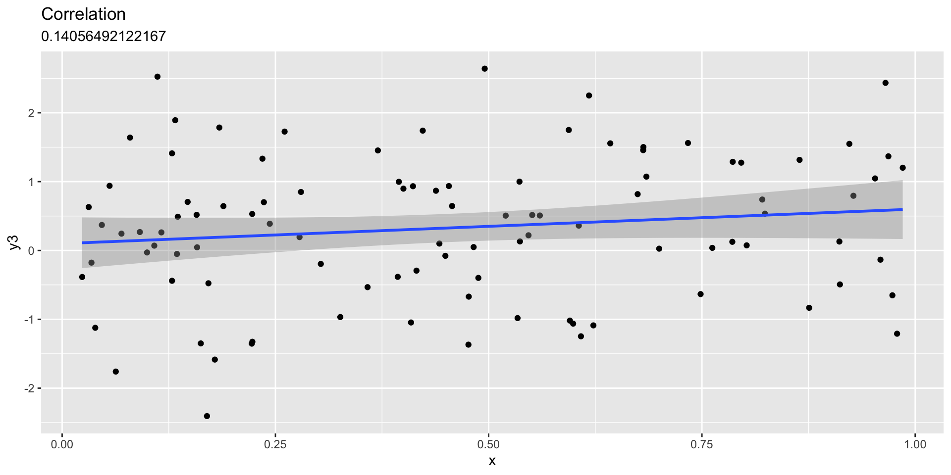
Linear fit with sd=1
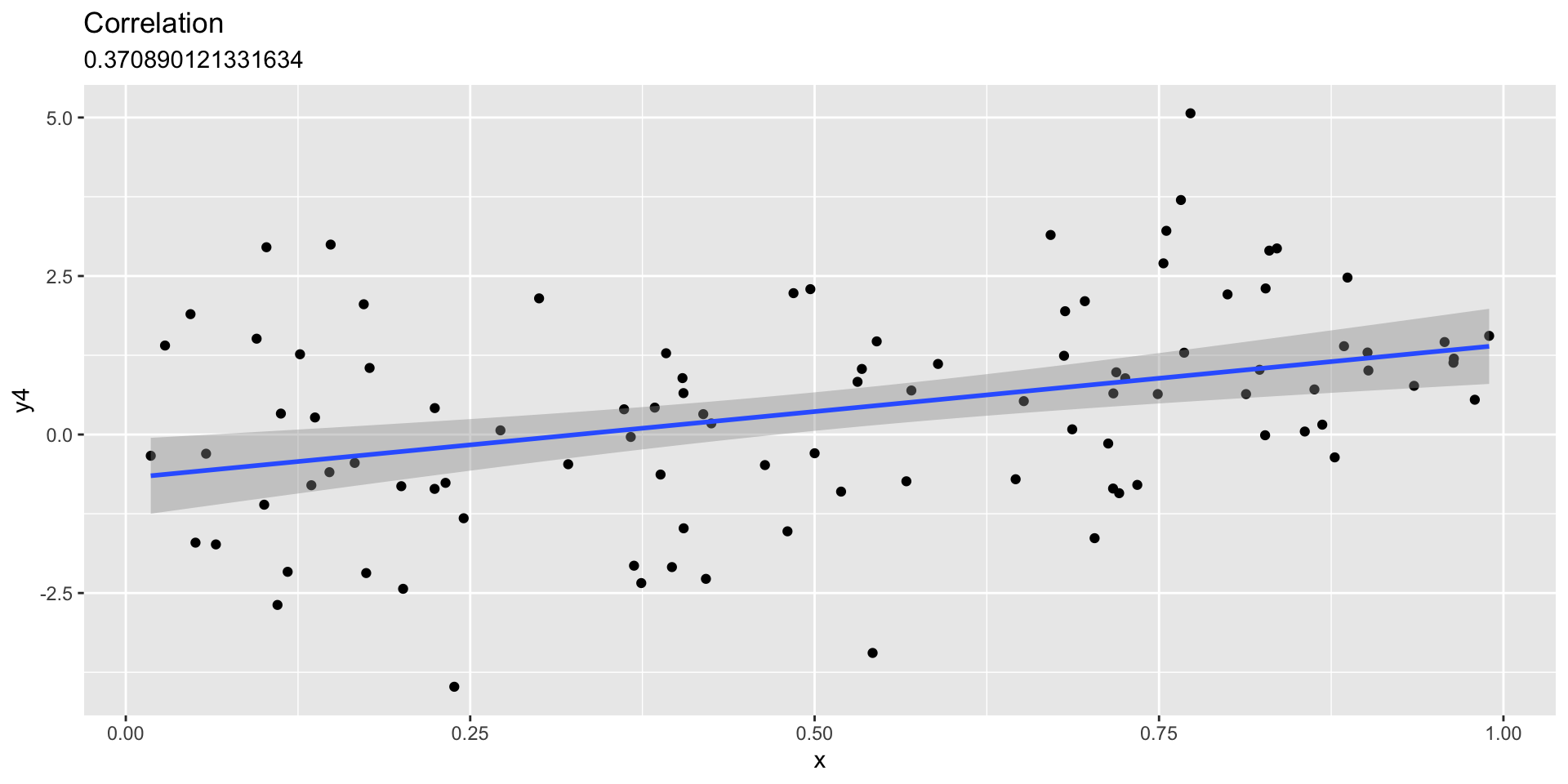
Linear fit with sd=1.5
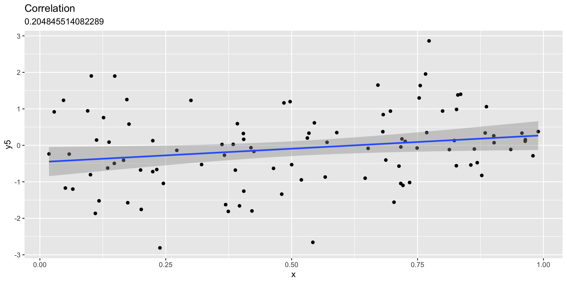
Linear fit with independent unrelated variables

Interim summary

  • Even when we know there are patterns/effects, conveying them accurately and effectively can be challenging

Franconeri, Padilla, Shah, Zacks, & Hullman (2021)

  • Reasoning about statistical properties is hard
  • Describing relative changes or relative risk is hard
  • Describing central tendencies of random processes is hard
  • More vs. less informative ways of conveying same data
  • Graphic experience/literacy varies (Zikmund-Fisher et al., 2014)]

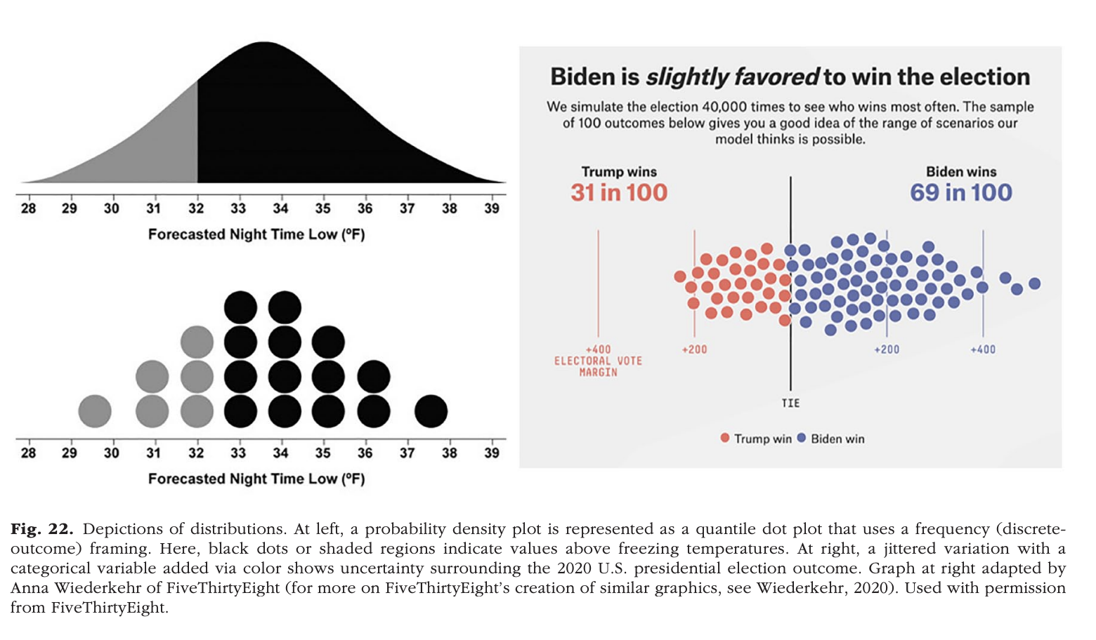
Figure 22 from Franconeri et al. (2021)

Figure 22 from Franconeri et al. (2021)

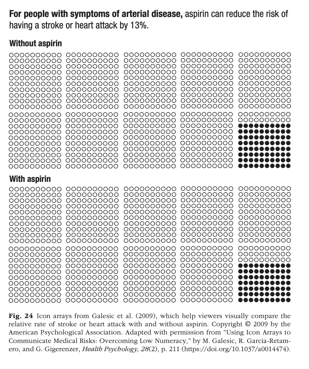
Figure 24 from Franconeri et al. (2021)

Figure 24 from Franconeri et al. (2021)

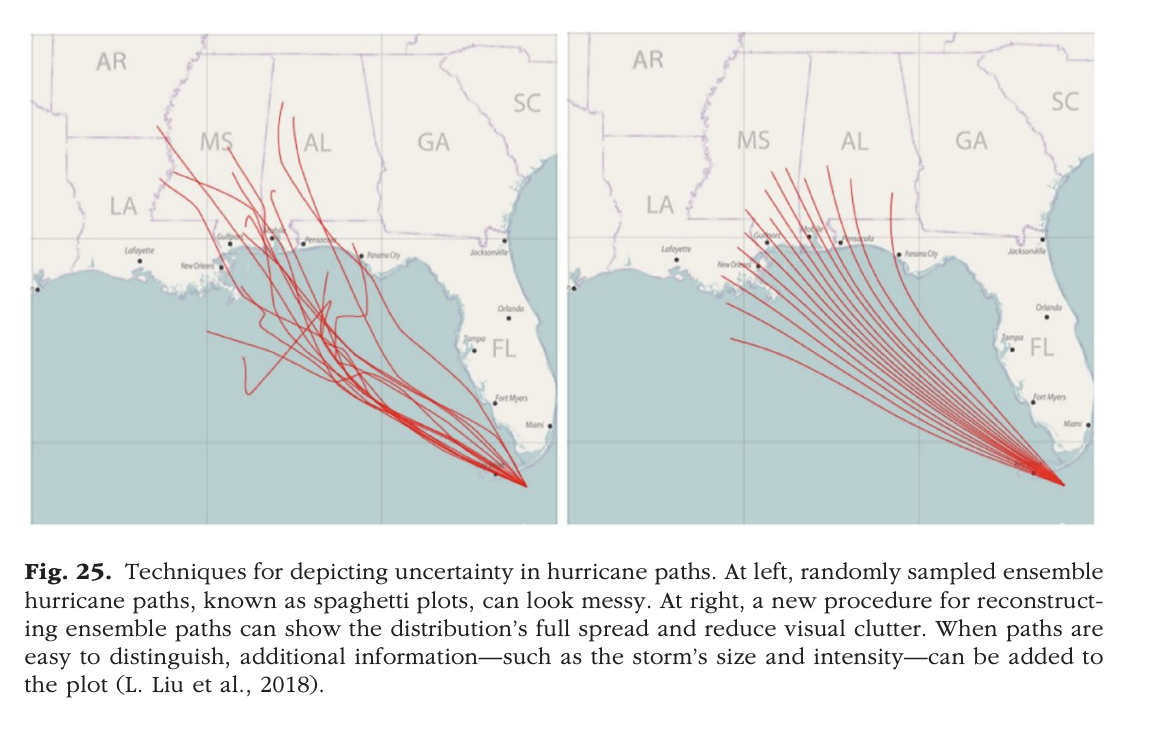
Figure 25 from Franconeri et al. (2021)

Figure 25 from Franconeri et al. (2021)

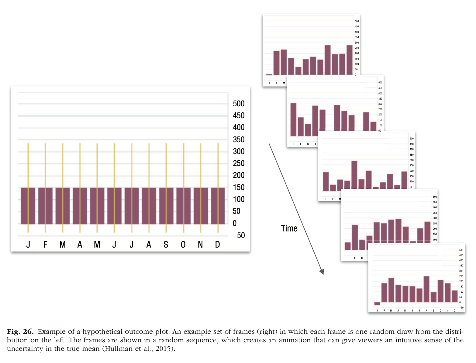
Figure 26 from Franconeri et al. (2021)

Figure 26 from Franconeri et al. (2021)

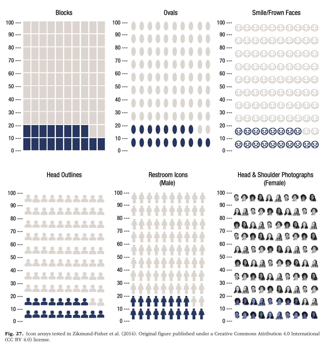
Figure 27 from Franconeri et al. (2021); Zikmund-Fisher et al. (2014)

Figure 27 from Franconeri et al. (2021); Zikmund-Fisher et al. (2014)

Risk recall was significantly higher with more anthropomorphic icons (restroom icons, head outlines, and photos) than with other icon types, and participants rated restroom icons as most preferred. However, while restroom icons resulted in the highest correlations between perceived and actual risk among more numerate/graphically literate participants, they performed no better than other icon types among less numerate/graphically literate participants.

Zikmund-Fisher et al. (2014)

Who understands what?

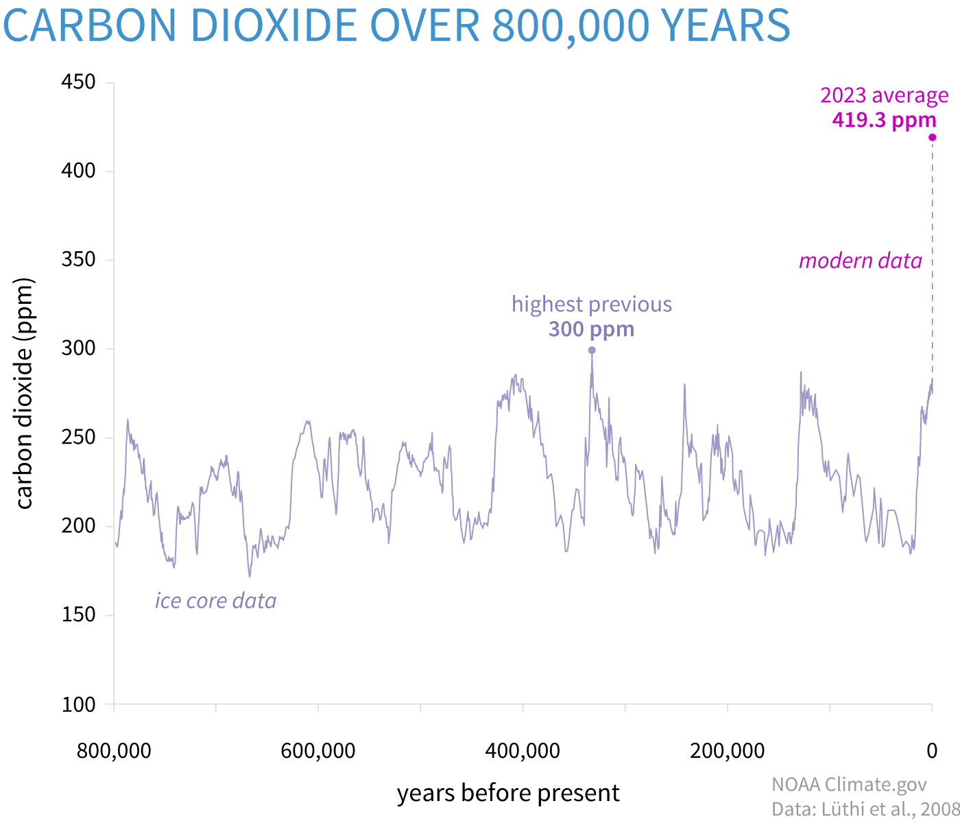
Lindsey (2024)

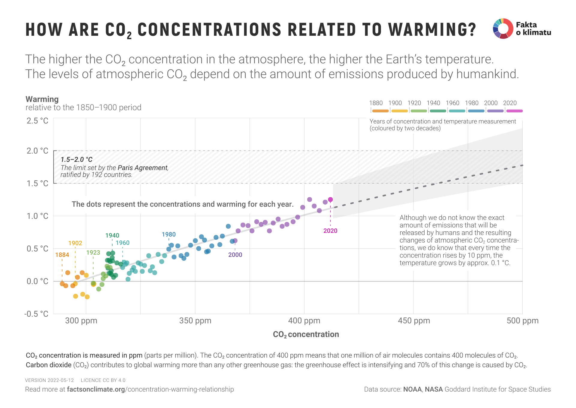
“How are CO₂ concentrations related to warming?” (n.d.)

Or this?

“Rate of measles cases and deaths in the united states, 1919 to 2024” (n.d.)

Work session

DataCamp
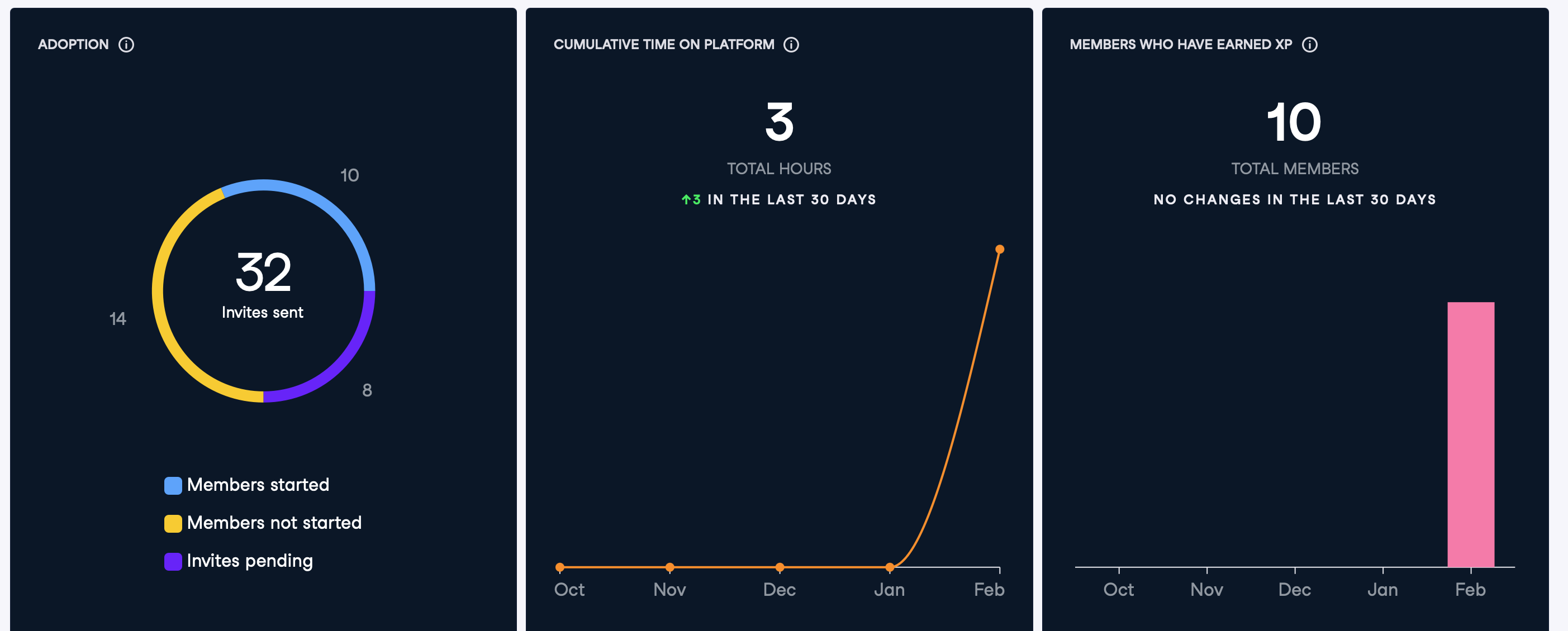
DataCamp status as of 2025-02-26-1534

Check-ins

  • Final Project proposal
  • Exercise 04

Next time

More Slow-R
Resources

References

Dwyer-Lindgren, L., Baumann, M. M., Li, Z., Kelly, Y. O., Schmidt, C., Searchinger, C., … Murray, C. J. (2024). Ten americas: A systematic analysis of life expectancy disparities in the USA. Lancet, 404, 2299–2313. https://doi.org/10.1016/S0140-6736(24)01495-8
Franconeri, S. L., Padilla, L. M., Shah, P., Zacks, J. M., & Hullman, J. (2021). The science of visual data communication: What works. Psychological Science in the Public Interest: A Journal of the American Psychological Society, 22(3), 110–161. https://doi.org/10.1177/15291006211051956
How are CO₂ concentrations related to warming? (n.d.). Retrieved February 17, 2025, from https://factsonclimate.org/infographics/concentration-warming-relationship
Lindsey, R. (2024, April 9). Climate change: Atmospheric carbon dioxide. Retrieved November 8, 2024, from http://www.climate.gov/news-features/understanding-climate/climate-change-atmospheric-carbon-dioxide
Rate of measles cases and deaths in the united states, 1919 to 2024. (n.d.). Retrieved February 27, 2025, from https://ourworldindata.org/grapher/measles-cases-and-death-rate
Zikmund-Fisher, B. J., Witteman, H. O., Dickson, M., Fuhrel-Forbis, A., Kahn, V. C., Exe, N. L., … Fagerlin, A. (2014). Blocks, ovals, or people? Icon type affects risk perceptions and recall of pictographs. Medical Decision Making: An International Journal of the Society for Medical Decision Making, 34, 443–453. https://doi.org/10.1177/0272989X13511706