Let’s focus on nominal or categorical data, specifically the favorite colors of some imaginary set of people.
Code
# Make an array of color namescolors <-c("red", "orange", "yellow", "green", "cyan", "blue", "violet", "white", "black", "gray")
There are n=10 colors in this set.
Your turn
Why are these data nominal or nominally scaled? Or rather, why aren’t they ordinal, interval, or ratio?
Generating
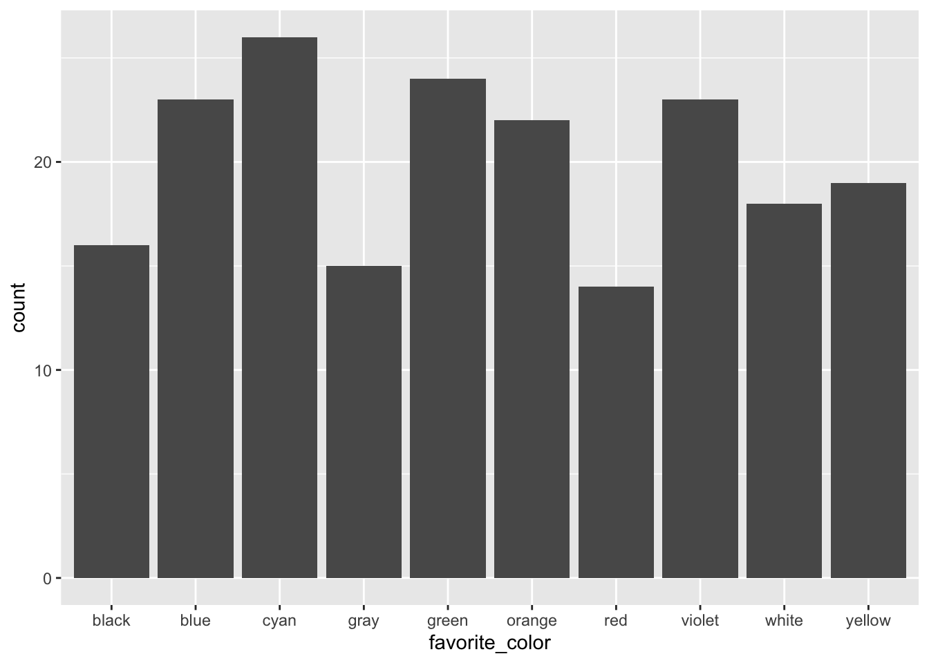
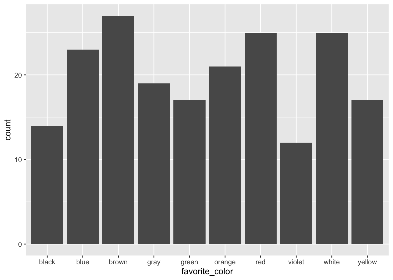
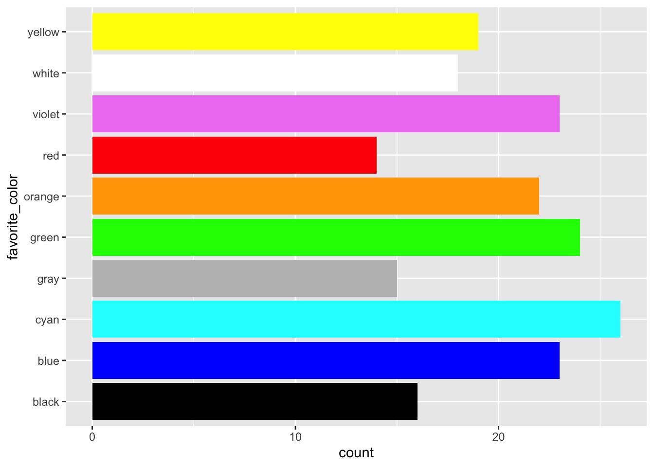
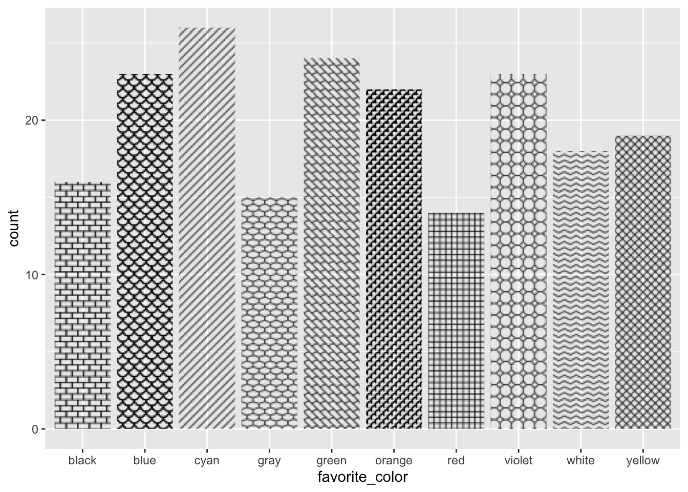
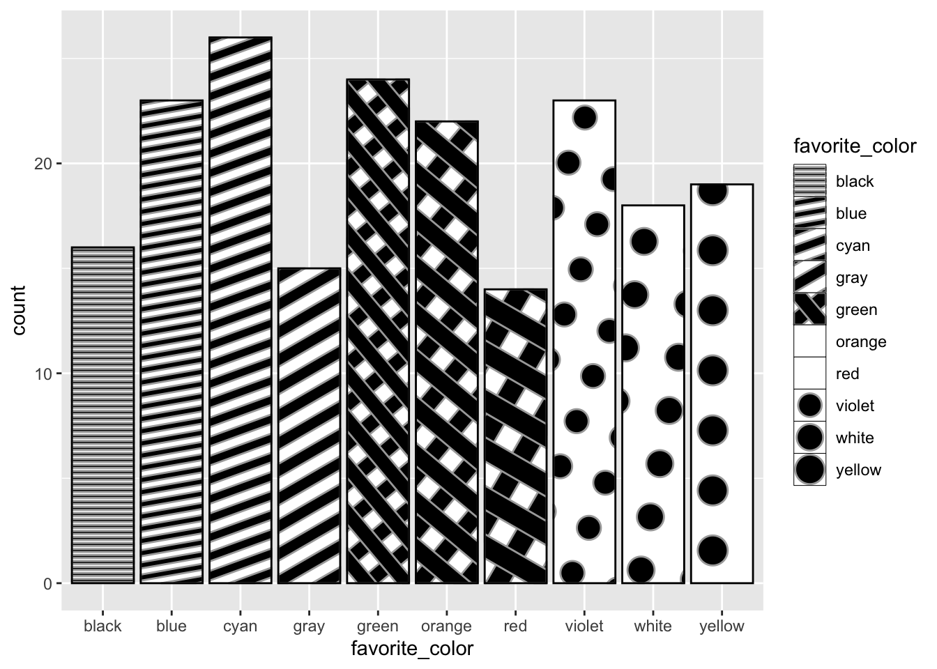
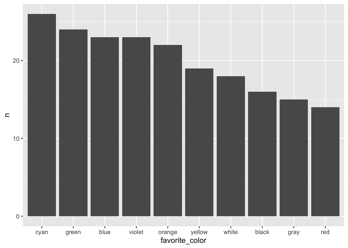
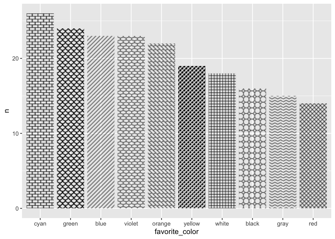
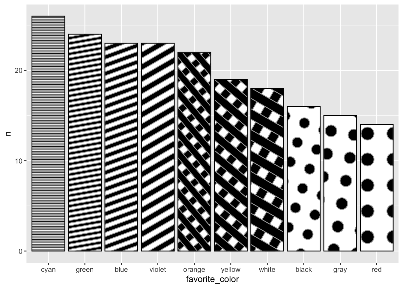
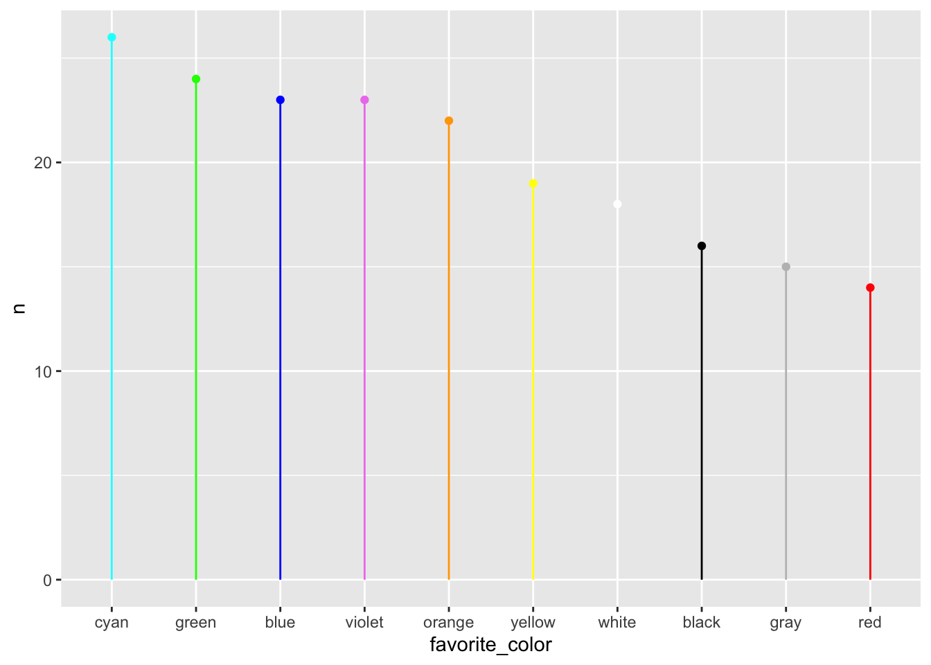
For demonstration purposes, we want to take some number of random samples of these colors. Let’s pick n=200 and sample with replacement (replace=TRUE in the code below), meaning that we could have any number of colors in our sample of 200 imaginary people.
Code
# Use `sample()` to pick a random sample of these *with* replacement so that # the numbers/color differ.our_color_sample <-sample(colors, size=200, replace=TRUE)our_color_sample
Figure 13: A horizontal barplot of the random favorite color data
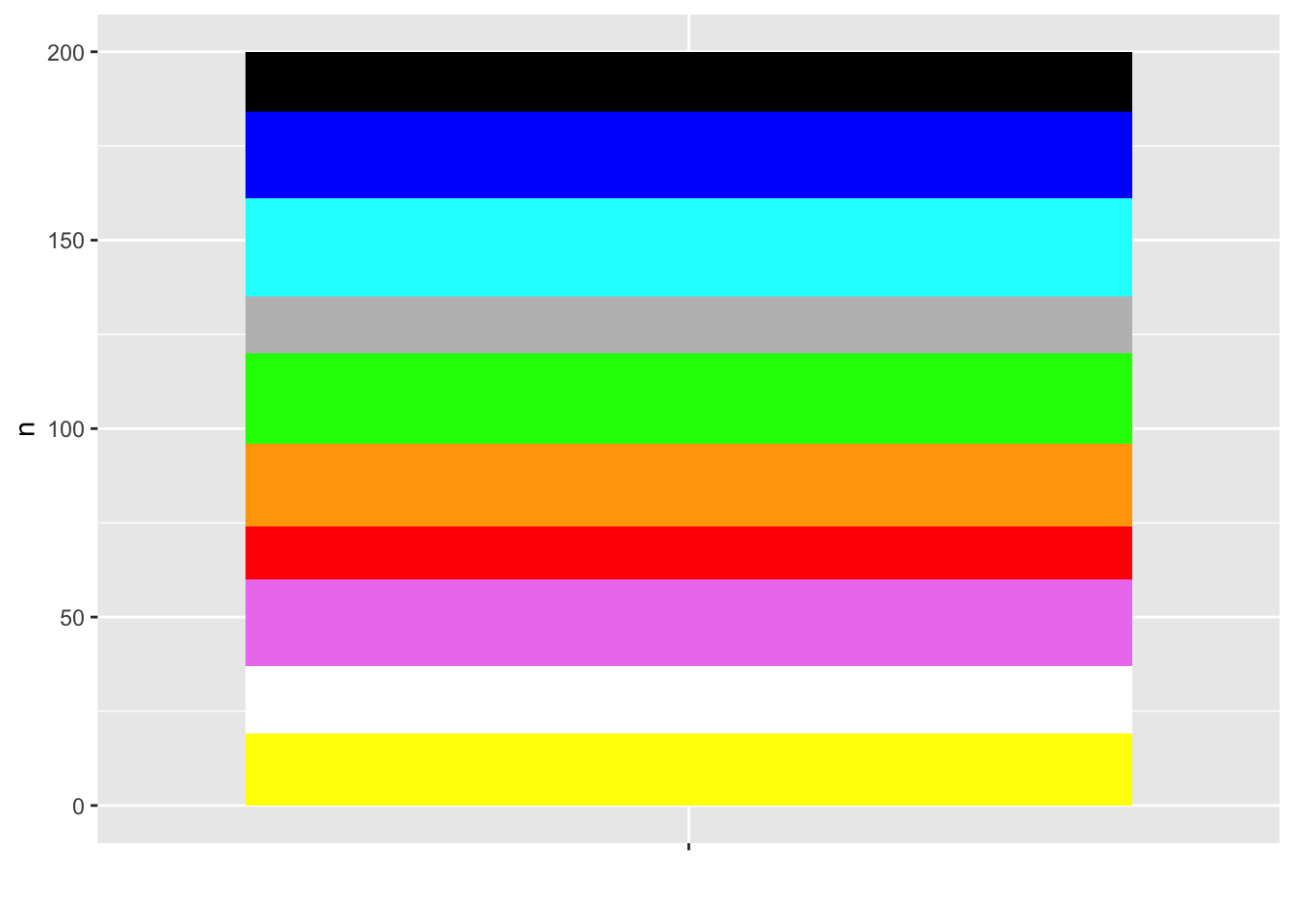
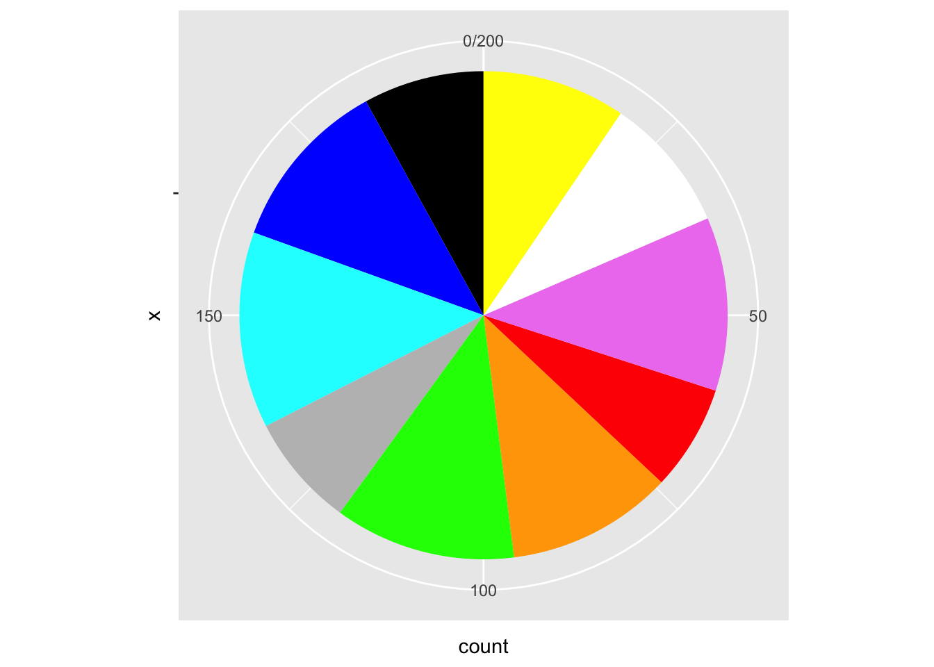
Pie chart
Code
colors_xtab <-data.frame(table(colors_df))names(colors_xtab) <-c("favorite_color", "count")colors_xtab |>ggplot(aes(x ="", y = count, fill = favorite_color)) +geom_bar(stat ="identity", width =1) +coord_polar("y", start =0) +scale_fill_identity()
Figure 14: A piechart of the random favorite color data
Ring chart
Code
# https://r-graph-gallery.com/128-ring-or-donut-plot.html# Compute percentagescolors_xtab$fraction = colors_xtab$count /sum(colors_xtab$count)# Compute the cumulative percentages (top of each rectangle)colors_xtab$ymax =cumsum(colors_xtab$fraction)# Compute the bottom of each rectanglecolors_xtab$ymin =c(0, head(colors_xtab$ymax, n =-1))# Make the plotcolors_xtab |>ggplot(aes(ymax = ymax,ymin = ymin,xmax =4,xmin =3,fill = favorite_color )) +geom_rect() +coord_polar(theta ="y") +# Try to remove that to understand how the chart is built initiallyxlim(c(2, 4)) +# Try to remove that to see how to make a pie chartscale_fill_identity()
Figure 15: A ring/donut chart of the random favorite color data
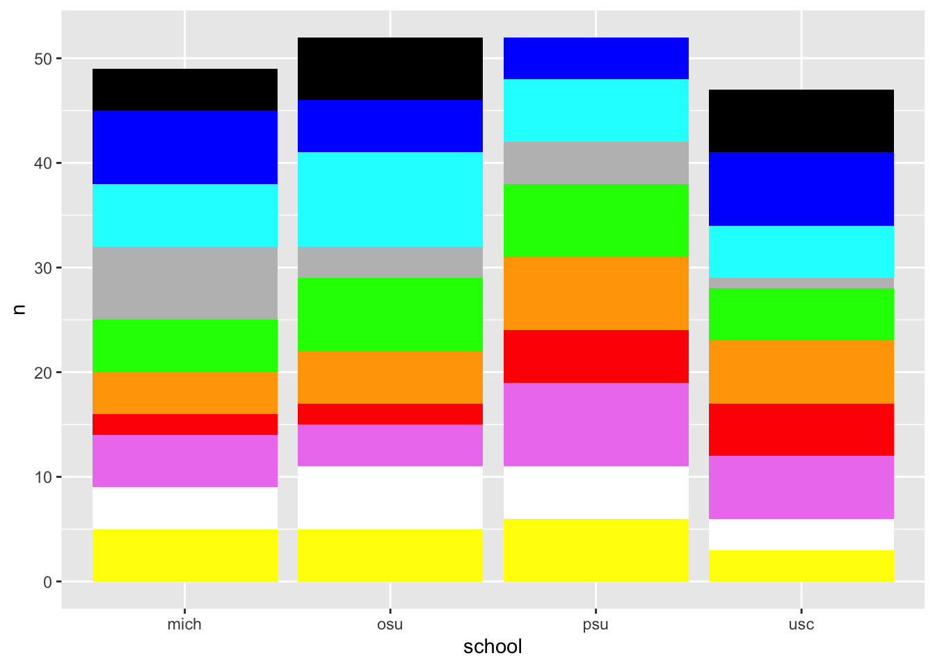
Mosaic plot
Code
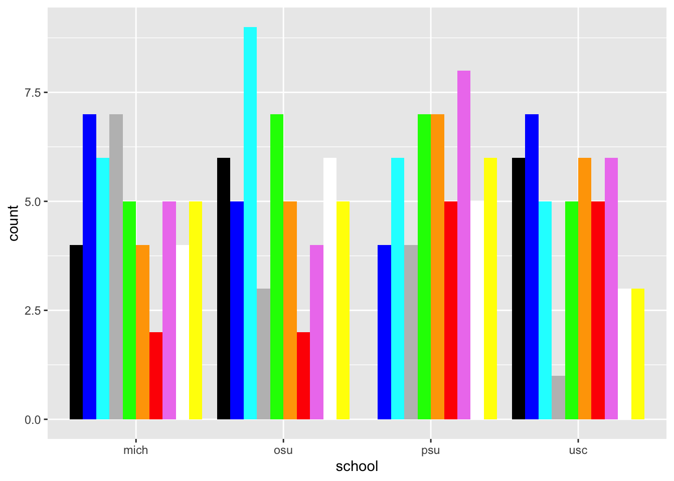
ggplot(data = colors_school_df) +geom_mosaic(aes(x =product(favorite_color, school), fill = favorite_color)) +labs(y="Favorite", x="School", title ="Favorite colors by school") +scale_fill_identity()
Warning: The `scale_name` argument of `continuous_scale()` is deprecated as of ggplot2
3.5.0.
Warning: The `trans` argument of `continuous_scale()` is deprecated as of ggplot2 3.5.0.
ℹ Please use the `transform` argument instead.
Warning: `unite_()` was deprecated in tidyr 1.2.0.
ℹ Please use `unite()` instead.
ℹ The deprecated feature was likely used in the ggmosaic package.
  Please report the issue at <https://github.com/haleyjeppson/ggmosaic>.
Figure 16: A mosaic chart of the random favorite color by school data
Ordinal data
We usually consider colors as nominal or categorical variables. But the physical input to the visual system is continuous.
The continuous variable that underlies color is wavelength, a property of electromagnetic radiation. The human visual system maps patterns of physical wavelength to the psychological dimension of color.
Curiously, human color perception shows that this psychological mapping wraps in a circular way that physical wavelength does not.
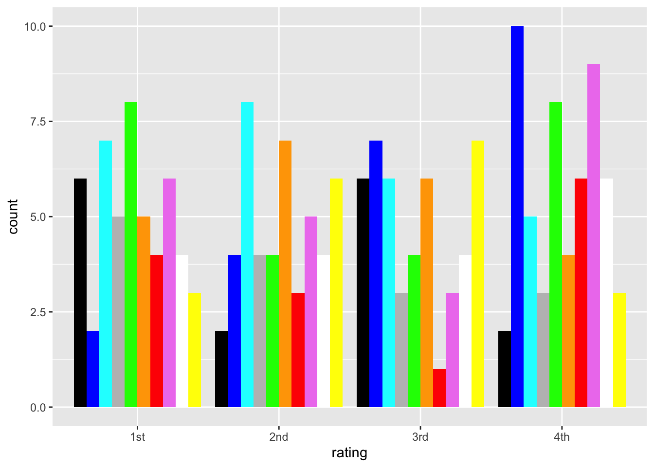
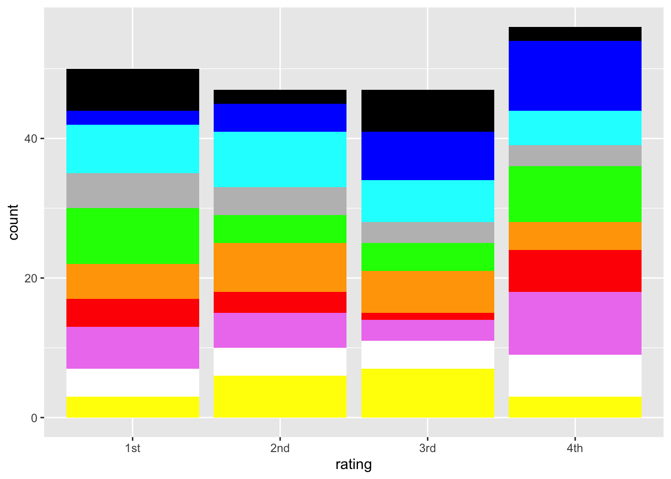
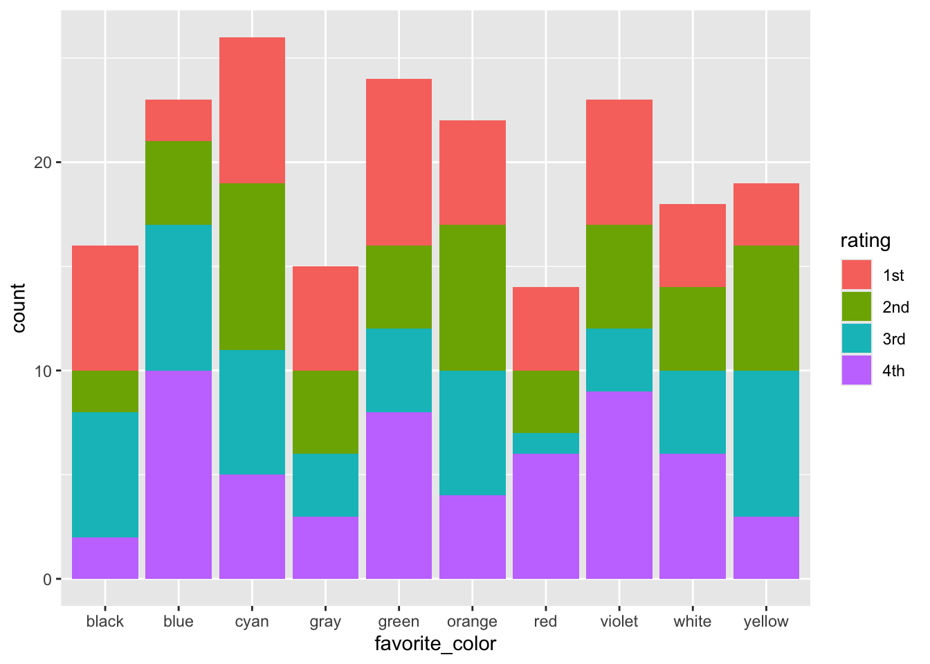
But rather than dive down that particular rat hole now, let’s make some ordinal data from the random color dataset. Imagine that we had n=50 participants and each gave a rating to these colors. The ratings had numbers, with 1 assigned to the participant’s first choice, and 4 assigned to the fourth choice. We won’t keep track of the specific users at this point.
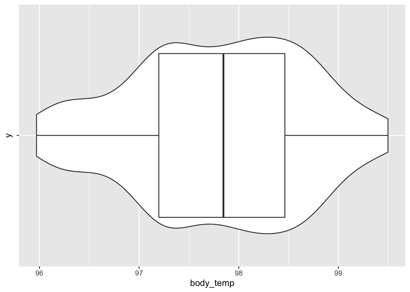
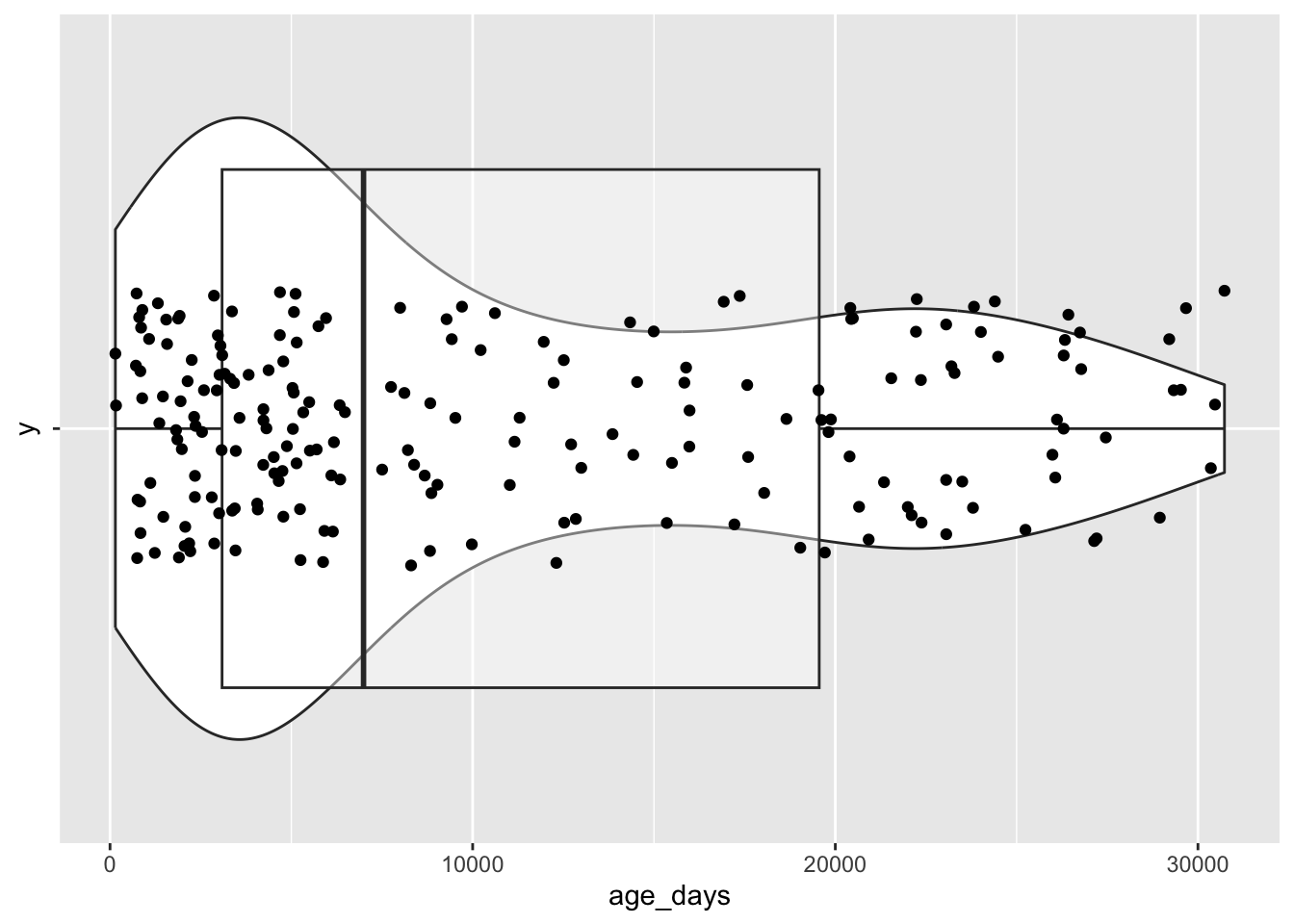
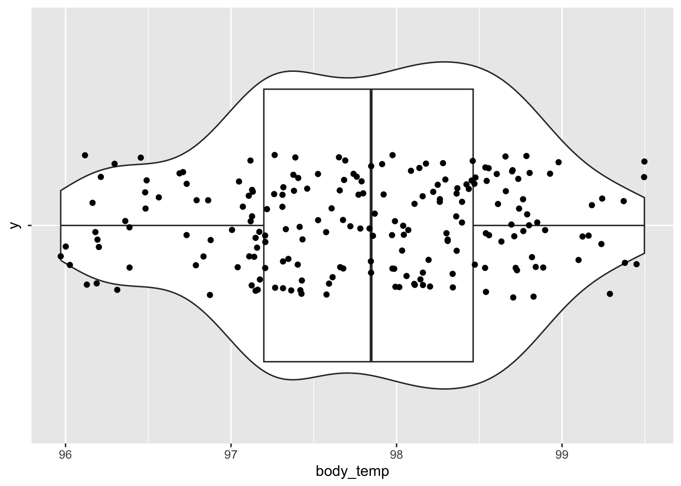
Figure 32: A combined violin/boxplot/scatterplot of the body temperature data.
References
Tufte, E. R. (2001). The Visual Display of Quantitative Information. Graphics Pr.
Source Code
---title: "Making and visualizing data"format: html---## About {-}This tutorial shows how we can construct data of different types.The material serves as a companion to the classes on [making data](../schedule.qmd#tuesday-january-28), [figure types](../schedule.qmd#thursday-january-30), and [figure components](../schedule.qmd#tuesday-february-04).```{r, message=FALSE, warning=FALSE}# Load required package dependencies "quietly"suppressPackageStartupMessages(library(ggplot2))suppressPackageStartupMessages(library(ggmosaic))suppressPackageStartupMessages(library(dplyr))suppressPackageStartupMessages(library(ggpattern))suppressPackageStartupMessages(library(fillpattern))```## Nominal data {-}Let's focus on nominal or categorical data, specifically the favorite colors of some imaginary set of people.```{r}# Make an array of color namescolors <-c("red", "orange", "yellow", "green", "cyan", "blue", "violet", "white", "black", "gray")```There are *n*=`{r} length(colors)` colors in this set.::: {.callout-note}## Your turnWhy are these data nominal or nominally scaled?Or rather, why *aren't* they ordinal, interval, or ratio?:::### Generating {-}For demonstration purposes, we want to take some number of random samples of these colors. Let's pick *n*=200 and sample *with replacement* (`replace=TRUE` in the code below), meaning that we could have any number of colors in our sample of 200 imaginary people.```{r}# Use `sample()` to pick a random sample of these *with* replacement so that # the numbers/color differ.our_color_sample <-sample(colors, size=200, replace=TRUE)our_color_sample```On its own, that's not especially easy to visualize.What if we sorted it?```{r}sort(our_color_sample)```Still not all that helpful.### Summarizing {-}What can we say to summarize categorical data?We can report the number of total responses.```{r}length(our_color_sample)```We can report the number of unique categories.```{r}length(unique(our_color_sample))```We can report the number of responses per category.```{r}colors_df <-data.frame(favorite_color = our_color_sample)xtabs(formula =~favorite_color, data = colors_df)```### Visualizing {-}Single nominal variables don't offer us many options for visualization.A bar plot showing the number of observations in each category seems to be it.```{r}#| label: fig-nominal-barplot-bw#| fig-cap: "A black and white barplot of the random favorite color data"colors_df |>ggplot() +aes(x = favorite_color) +geom_bar(stat ="count")```We can also add colors to the bars.```{r}#| label: fig-nominal-barplot#| fig-cap: "A colorful barplot of the random favorite color data"colors_df |>ggplot() +aes(x = favorite_color, fill = favorite_color) +geom_bar() +scale_discrete_manual(aesthetics =c("color", "fill"),values =sort(colors))```We can think of this as mapping the name of the color category in our data to the way that category is represented in our figure.We can flip the axis just for fun.Which is more readable?#### Horizontal barplot {-}```{r}#| label: fig-nominal-barplot-horiz#| fig-cap: "A colorful horizontal barplot of the random favorite color data"colors_df |>ggplot() +aes(x = favorite_color, fill = favorite_color) +scale_fill_identity() +geom_bar() +coord_flip()```#### Bar/column with textures {-}Sometimes we don't want to use color to distinguish nominal categories. ```{r}#| label: fig-nominal-barplot-texture#| fig-cap: "A barplot of the random favorite color data using *textures*"#| warning: falsecolors_df |>ggplot() +aes(x = favorite_color, fill = favorite_color) +geom_bar(aes(y =after_stat(count))) +scale_fill_pattern() +# from package 'fillpattern' theme(legend.position ="none")```Or, we want to use some different textures and have control over them.```{r}#| label: fig-nominal-barplot-texture-2#| fig-cap: "A barplot of the random favorite color data using *textures*"#| warning: falsecolors_xtab <-data.frame(table(colors_df))names(colors_xtab) <-c("favorite_color", "count")colors_xtab |>ggplot() +aes(x = favorite_color, y = count) +# From package 'ggpattern'# See https://r-graph-gallery.com/368-black-and-white-barchart.htmlgeom_col_pattern(aes(pattern = favorite_color,pattern_angle = favorite_color,pattern_spacing = favorite_color ),fill ='white',color ='black',pattern_density =0.5,pattern_fill ='black',pattern_color ='darkgrey' )```#### Ordered {-}It can be useful to sort the counts of nominal variables to faciliate comparisons among categories.```{r}#| label: fig-nominal-barplot-horiz-ordered#| fig-cap: "A horizontal barplot of the random favorite color data, sorted"colors_df |>count(favorite_color) |>arrange(desc(n)) |>mutate(favorite_color =factor(favorite_color, levels = favorite_color)) |>ggplot() +aes(x = favorite_color) +geom_bar(aes(y = n), stat ="identity")```Let's order the other ones while we're at it.```{r}#| label: fig-nominal-barplot-texture-sorted#| fig-cap: "A barplot of the random favorite color data using *textures*"#| warning: falsecolors_df |>count(favorite_color) |>arrange(desc(n)) |>mutate(favorite_color =factor(favorite_color, levels = favorite_color)) |>ggplot() +aes(x = favorite_color, y = n, fill = favorite_color) +geom_bar(stat ="identity") +scale_fill_pattern() +# from package 'fillpattern'theme(legend.position ="none") ``````{r}#| label: fig-nominal-barplot-texture-sorted-2#| fig-cap: "A barplot of the random favorite color data using *textures*"#| warning: falsecolors_df |>count(favorite_color) |>arrange(desc(n)) |>mutate(favorite_color =factor(favorite_color, levels = favorite_color)) |>ggplot() +aes(x = favorite_color, y = n) +# From package 'ggpattern'# See https://r-graph-gallery.com/368-black-and-white-barchart.htmlgeom_col_pattern(aes(pattern = favorite_color,pattern_angle = favorite_color,pattern_spacing = favorite_color ),fill ='white',color ='black',pattern_density =0.5,pattern_fill ='black',pattern_color ='darkgrey' ) +theme(legend.position ="none")```#### Lollipop chart {-}The lollipop chart uses less ink, so the ink/data ratio [@Tufte2001-cb] is higher than with barplots.```{r}#| label: fig-nominal-lollipop#| fig-cap: "A lollipop plot of the random favorite color data"colors_df |>count(favorite_color) |>arrange(desc(n)) |>mutate(favorite_color =factor(favorite_color, levels = favorite_color)) |>ggplot() +geom_point(aes(x = favorite_color,y = n,color = favorite_color,fill = favorite_color )) +geom_segment(aes(x = favorite_color,xend = favorite_color,y =0,yend = n,color = favorite_color )) +scale_color_identity() +scale_fill_identity()```#### Stacked barplot {-}We can also stack them.```{r}#| label: fig-nominal-barplot-stacked-1#| fig-cap: "A stacked barplot of the random favorite color data"colors_df |>count(favorite_color) |>ggplot() +aes(x ="", y = n, fill = favorite_color) +geom_col(position ="stack") +scale_fill_identity() +xlab("")```This makes more sense with another nominal variable in the mix.Let's add a 'school' variable.```{r}school <-sample(c("psu", "osu", "mich", "usc"), size=200, replace=TRUE)colors_school_df <- colors_dfcolors_school_df$school <- school```Then create the plot.```{r}#| label: fig-nominal-barplot-stacked#| fig-cap: "A stacked barplot of the random favorite color data"colors_school_xtab <-data.frame(table(colors_school_df))names(colors_school_xtab) <-c("favorite_color", "school", "count")# colors_school_xtab |># ggplot() +# aes(x = school, y=count, fill = favorite_color) +# scale_fill_identity() +# geom_bar(stat="identity", position="stack")colors_school_df |>count(school, favorite_color) |>ggplot() +aes(school, n, fill = favorite_color) +scale_fill_identity() +geom_bar(stat="identity", position="stack")```#### Stacked barplot alternative {-}```{r}#| label: fig-nominal-barplot-stacked-alt#| fig-cap: "Another stacked barplot of the random favorite color data."colors_school_xtab |>ggplot() +aes(x = favorite_color, y=count, fill = school) +geom_bar(stat="identity", position="stack")```#### Dodged barplot {-}Using the 'dodge' parameter is another way to show data with two categorical variables.```{r}#| label: fig-nominal-barplot-dodge#| fig-cap: "A horizontal barplot of the random favorite color data"colors_school_xtab |>ggplot() +aes(x = school, y=count, fill = favorite_color) +scale_fill_identity() +geom_bar(stat="identity", position="dodge")```#### Pie chart {-}```{r}#| label: fig-nominal-pie-chart#| fig-cap: "A piechart of the random favorite color data"#| colors_xtab <-data.frame(table(colors_df))names(colors_xtab) <-c("favorite_color", "count")colors_xtab |>ggplot(aes(x ="", y = count, fill = favorite_color)) +geom_bar(stat ="identity", width =1) +coord_polar("y", start =0) +scale_fill_identity()```#### Ring chart {-}```{r}#| label: fig-nominal-ring-chart#| fig-cap: "A ring/donut chart of the random favorite color data"# https://r-graph-gallery.com/128-ring-or-donut-plot.html# Compute percentagescolors_xtab$fraction = colors_xtab$count /sum(colors_xtab$count)# Compute the cumulative percentages (top of each rectangle)colors_xtab$ymax =cumsum(colors_xtab$fraction)# Compute the bottom of each rectanglecolors_xtab$ymin =c(0, head(colors_xtab$ymax, n =-1))# Make the plotcolors_xtab |>ggplot(aes(ymax = ymax,ymin = ymin,xmax =4,xmin =3,fill = favorite_color )) +geom_rect() +coord_polar(theta ="y") +# Try to remove that to understand how the chart is built initiallyxlim(c(2, 4)) +# Try to remove that to see how to make a pie chartscale_fill_identity()```#### Mosaic plot {-}```{r}#| label: fig-nominal-mosaic-chart#| fig-cap: "A mosaic chart of the random favorite color by school data"ggplot(data = colors_school_df) +geom_mosaic(aes(x =product(favorite_color, school), fill = favorite_color)) +labs(y="Favorite", x="School", title ="Favorite colors by school") +scale_fill_identity()```## Ordinal data {-}We usually consider colors as nominal or categorical variables.But the physical input to the visual system is *continuous*.The continuous variable that underlies color is *wavelength*, a property of electromagnetic radiation.The human visual system maps patterns of *physical* wavelength to the *psychological* dimension of color.Curiously, human color perception shows that this *psychological* mapping wraps in a circular way that *physical* wavelength does not.### Generating {-}But rather than dive down that particular rat hole now, let's make some ordinal data from the random color dataset.Imagine that we had *n*=50 participants and each gave a rating to these colors. The ratings had numbers, with 1 assigned to the participant's first choice, and 4 assigned to the fourth choice.We won't keep track of the specific users at this point.```{r}ratings <-c("1st", "2nd", "3rd", "4th")our_rating_sample <-sample(ratings, size=200, replace=TRUE)colors_rating_df <- colors_dfcolors_rating_df$rating <- our_rating_samplecolors_rating_xtab <-data.frame(table(colors_rating_df))names(colors_rating_xtab) <-c("favorite_color", "rating", "count")```### Visualizing {-}Many of the same plot types are available for ordinal data.#### Bar plot ordinal dodge {-}```{r}#| label: fig-ordinal-barplot-dodge#| fig-cap: "A barplot of the random favorite color data with an ordinal rating"colors_rating_xtab |>ggplot() +aes(x=rating, y=count, fill = favorite_color) +# aes(x = favorite_color, y = school, fill = favorite_color) +scale_fill_identity() +geom_bar(stat="identity", position="dodge")```#### Bar plot ordinal stacked {-}```{r}#| label: fig-ordinal-barplot-stacked#| fig-cap: "A stacked barplot of the random favorite color data with an ordinal rating"# colors_rating_xtab |># ggplot() +# aes(x=favorite_color, y=count, fill = favorite_color) +# scale_fill_identity() +# geom_bar(stat="identity", position="dodge")colors_rating_xtab |>ggplot() +aes(x = rating, y=count, fill = favorite_color) +scale_fill_identity() +geom_bar(stat="identity", position="stack")```#### Bar plot ordinal stacked alternative {-}```{r}#| label: fig-ordinal-barplot-stacked-alt#| fig-cap: "Another stacked barplot of the random favorite color data with an ordinal rating"colors_rating_xtab |>ggplot() +aes(x = favorite_color, y=count, fill = rating) +geom_bar(stat="identity", position="stack")```## Continuous data {-}### Generating {-}Let's imagine that we are studying a group of people who vary in age and body temperature.We'll assume that they are healthy--fever free.And we assume that we're sampling *uniformly* across children (0-18 years) and adults (18-85).```{r}n_kids <-100n_adults <-100age_days_kids <-runif(n_kids, 0, 18*365)age_days_adults <-runif(n_adults, 18*365+1, 85*365)# https://www.webmd.com/first-aid/normal-body-temperaturebody_temps_kids <-runif(n_kids, 95.9, 99.5)body_temps_adults <-runif(n_adults, 97, 99)age_days <-c(age_days_kids, age_days_adults)body_temp_F <-c(body_temps_kids, body_temps_adults)age_temp_df <-data.frame(age_days = age_days, body_temp = body_temp_F)# Mix them up a bitage_temp_df <- age_temp_df[sample(nrow(age_temp_df)),]```### Visualizing {-}To visualize continuous data, we have to decide what question(s) we want to answer.#### Scatterplot {-}The simplest visualization of two continuous variables is a scatterplot.```{r}#| label: fig-continuous-scatter#| fig-cap: "A scatterplot of the age and body temperature data."age_temp_df |>ggplot() +aes(x = age_days, y = body_temp) +geom_point()```#### Histograms {-}```{r}#| label: fig-continuous-histogram-age#| fig-cap: "A histogram of the age data."age_temp_df |>ggplot() +aes(x = age_days) +geom_histogram()``````{r}#| label: fig-continuous-histogram-temp#| fig-cap: "A histogram of the body temperature data."age_temp_df |>ggplot() +aes(x = body_temp) +geom_histogram()```#### Violin plots {-}```{r}#| label: fig-continuous-violin-age#| fig-cap: "A violin plot of the age data."age_temp_df |>ggplot() +aes(x = age_days, y ="") +geom_violin()``````{r}#| label: fig-continuous-violin-temp#| fig-cap: "A violin plot of the body temperature data."age_temp_df |>ggplot() +aes(y ="", x = body_temp) +geom_violin()```#### Density {-}```{r}#| label: fig-continuous-density-age#| fig-cap: "A density plot of the age data."age_temp_df |>ggplot() +aes(x = age_days) +geom_density()``````{r}#| label: fig-continuous-density-temp#| fig-cap: "A density plot of the body temperature data."age_temp_df |>ggplot() +aes(x = body_temp) +geom_density()```#### Boxplot {-}```{r}#| label: fig-continuous-boxplot-age#| fig-cap: "A boxplot of the age data."age_temp_df |>ggplot() +aes(x = age_days) +geom_boxplot()``````{r}#| label: fig-continuous-boxplot-temp#| fig-cap: "A boxplot of the body temperature data."age_temp_df |>ggplot() +aes(x = body_temp) +geom_boxplot()```#### Violin + Boxplot {-}```{r}#| label: fig-continuous-violin-boxplot-age#| fig-cap: "A combined violin/boxplot of the age data."age_temp_df |>ggplot() +aes(x = age_days, y ="") +geom_violin() +geom_boxplot(alpha = .4)``````{r}#| label: fig-continuous-violin-boxplot-temp#| fig-cap: "A combined violin/boxplot of the body temperature data."age_temp_df |>ggplot() +aes(x = body_temp, y ="") +geom_violin() +geom_boxplot(alpha = .4)```#### Violin + Boxplot + Scatter {-}```{r}#| label: fig-continuous-violin-boxplot-scatter-age#| fig-cap: "A combined violin/boxplot/scatterplot of the age data."age_temp_df |>ggplot() +aes(x = age_days, y ="") +geom_violin() +geom_boxplot(alpha = .4) +geom_jitter(width =0, height = .2)``````{r}#| label: fig-continuous-violin-boxplot-scatter-temp#| fig-cap: "A combined violin/boxplot/scatterplot of the body temperature data."age_temp_df |>ggplot() +aes(x = body_temp, y ="") +geom_violin() +geom_boxplot(alpha = .4) +geom_jitter(width =0, height = .2)```