This document discusses why it is a good idea to plot your data before you run descriptive or predictive statistical models. It also discusses degrees of freedom, and why the idea is important.
library(ggplot2)library(datasauRus)library(dplyr)
Attaching package: 'dplyr'
The following objects are masked from 'package:stats':

    filter, lag
The following objects are masked from 'package:base':

    intersect, setdiff, setequal, union
library(stats)library(graphics)
Plot your data
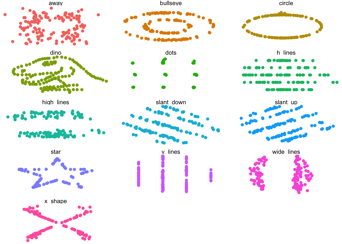
Here are a bunch of scatter plots.
ggplot(datasaurus_dozen, aes(x = x, y = y, colour = dataset))+geom_point() +theme_void() +theme(legend.position ="none")+facet_wrap(~dataset, ncol =3)
Think about that a minute. If we didn’t plot the data and only had the means, standard deviations, and correlation values available from some table in a paper, we’d think these sets of variables were essentially the same, wouldn’t we?
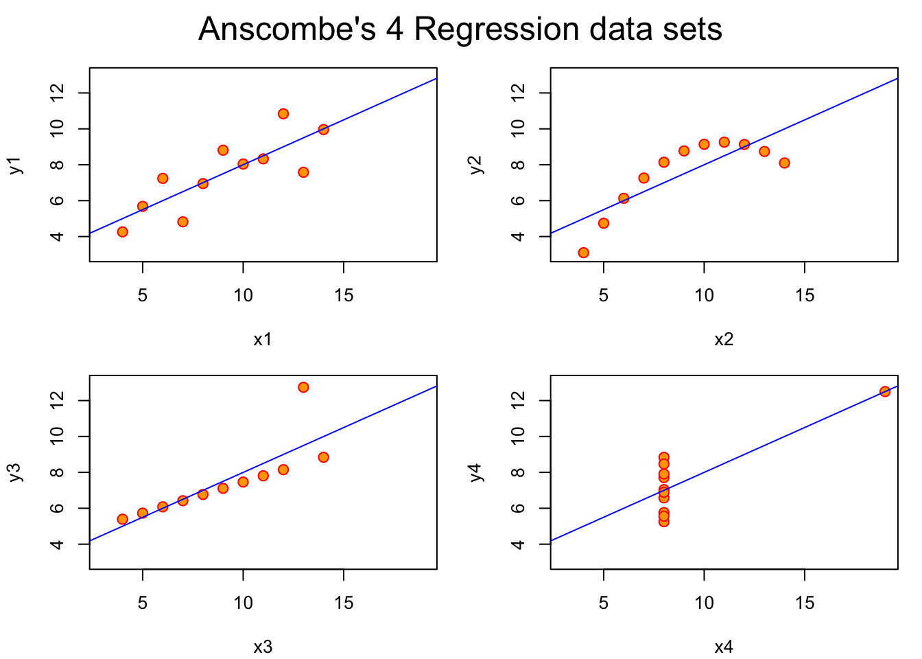
       x1             x2             x3             x4           y1
 Min.   : 4.0   Min.   : 4.0   Min.   : 4.0   Min.   : 8   Min.   : 4.260
 1st Qu.: 6.5   1st Qu.: 6.5   1st Qu.: 6.5   1st Qu.: 8   1st Qu.: 6.315
 Median : 9.0   Median : 9.0   Median : 9.0   Median : 8   Median : 7.580
 Mean   : 9.0   Mean   : 9.0   Mean   : 9.0   Mean   : 9   Mean   : 7.501
 3rd Qu.:11.5   3rd Qu.:11.5   3rd Qu.:11.5   3rd Qu.: 8   3rd Qu.: 8.570
 Max.   :14.0   Max.   :14.0   Max.   :14.0   Max.   :19   Max.   :10.840
       y2              y3              y4
 Min.   :3.100   Min.   : 5.39   Min.   : 5.250
 1st Qu.:6.695   1st Qu.: 6.25   1st Qu.: 6.170
 Median :8.140   Median : 7.11   Median : 7.040
 Mean   :7.501   Mean   : 7.50   Mean   : 7.501
 3rd Qu.:8.950   3rd Qu.: 7.98   3rd Qu.: 8.190
 Max.   :9.260   Max.   :12.74   Max.   :12.500
Note
I don’t remember my stats professor showing us Anscombe’s datasets. The datasauRus came along much later. But I’m pretty sure this was what he had in mind when he exhorted the class to “plot your data!” It’s excellent advice, and I try to follow it as an author and as a reviewer.
Degrees of freedom
One way to think about what’s going on here is that we analysts want an efficient way to summarize complex sets of data. Statistics like the mean or median, standard deviation, and correlation often do that. If a big set of data is well described by one of these statistics, then we’ve saved ourselves a lot of time and headache. If we think about a summary of some dataset as having \(m\) degrees of freedom, what we mean is that we only need \(m\) numbers for the summary. So, if we summarize a big dataset with the mean, then our summary (or model) has only one degree of freedom. If we include the standard deviation, then our summary has two degrees of freedom. If we use a linear regression to predict y ~ x then we usually have a slope estimate and an intercept estimate, or two degrees of freedom.
If we’re summarizing a raw dataset with \(n=142\) points in X and \(n=142\) datapoints in Y like the datasauRus sets above, being able to summarize with just a few numbers (degrees of freedom) is powerful and efficient. And in general, we analysts favor more parsimonious models of data–those with fewer degrees of freedom.
The problem arises when our simple models with few degrees of freedom don’t really capture important information about datasets, or when they persuade us to think (wrongly) that datasets with the same summary statistics are necessarily comparable. They might be, but they might not be. We have to look at the data–plot it–and confirm that we haven’t lost information in simplifying a dataset with a small number of statistics. The datasauRus and anscombe plots show us perverse situations when the small degree of freedom summaries are deeply misleading.
The converse is also true. We can describe a dataset increasingly precisely with a large number of degrees of freedom. For example, imagine that our model of one of the datasauRus sets has \(2*n\) degrees of freedom, where \(n=142\). If those 284 numbers are equal to the data points themselves, our summary has captured the data exactly. But we haven’t really gained anything, have we? We’ve just redescribed the data without reducing it to a summary with fewer degrees of freedom than existed in the first place. So, the best summaries (models) of data are small (in the number of degrees of freedom), but not too small.
Researcher degrees of freedom
When (Simmons, Nelson, & Simonsohn, 2011) discuss ‘researcher degrees of freedom’, they extend these ideas in a new direction. How many steps (degrees of freedom) did the analysts take to reach their conclusions? Ideally, as few as possible, and certainly far less than the number of data points.
So, how many researcher degrees of freedom are too many? That’s a judgment call. But whatever you determine, justify your argument. And maybe see whether the authors plotted their data in a way that helps make a case one way or the other.
Matejka, J., & Fitzmaurice, G. (2017). Same stats, different graphs: Generating datasets with varied appearance and identical statistics through simulated annealing. In Proceedings of the 2017 CHI conference on human factors in computing systems (pp. 1290–1294). New York, NY, USA: Association for Computing Machinery. https://doi.org/10.1145/3025453.3025912
Simmons, J. P., Nelson, L. D., & Simonsohn, U. (2011). False-positive psychology: Undisclosed flexibility in data collection and analysis allows presenting anything as significant. Psychological Science, 22(11), 1359–1366. https://doi.org/10.1177/0956797611417632