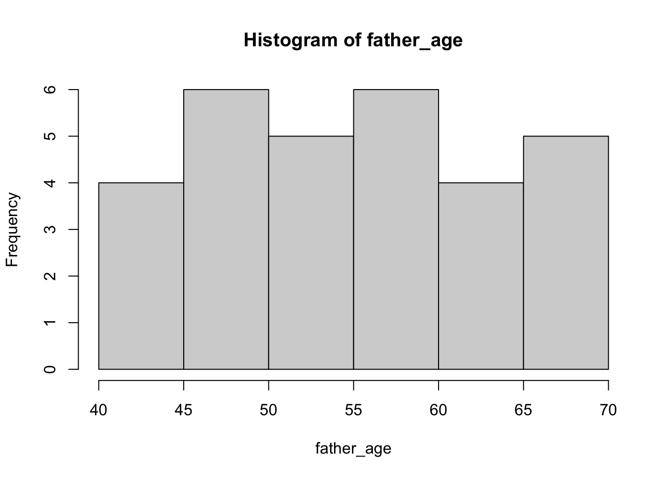
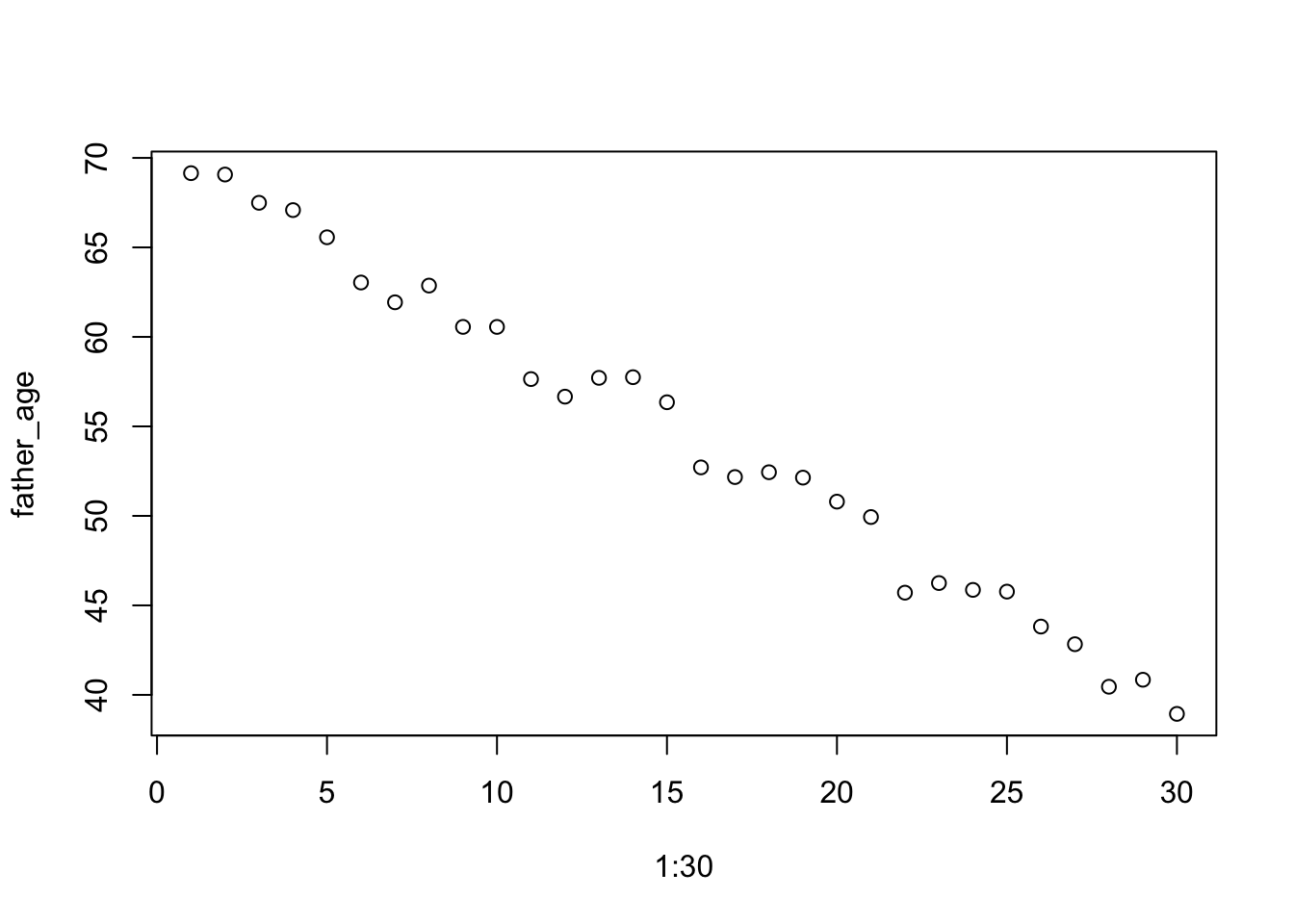
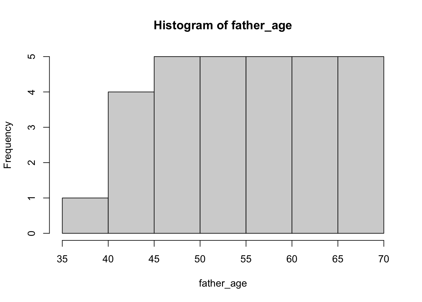
There is one covariate, father’s age. Let’s say that these are uniformly distributed between 40 and 70.
father_age <-runif(n =30, min =40, max =70)hist(father_age)
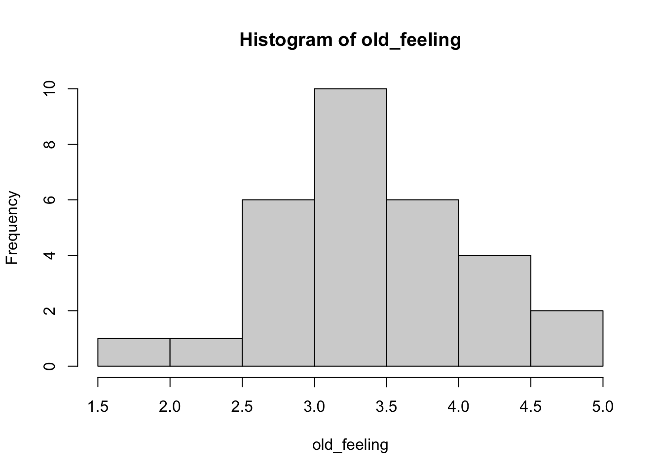
And there is one dependent (outcome) measure that is the focus, “How old do you feel right now?”, with five options: very young, young, neither young nor old, old, and very old. Let’s give these ratings numbers between 1 and 5, and let’s say that the average rating for the “kid” group was 3.75 and the average rating for the “ctrl” group was 3. We’ll assume that each of the groups ratings are normally distributed around these two means.
old_feeling <-c(rnorm(15, mean =3.75, sd =0.5), rnorm(15, mean =3, sd =0.5))hist(old_feeling)
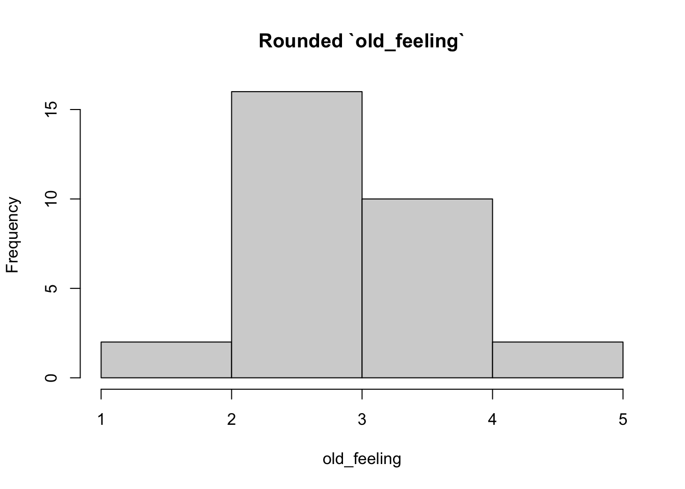
But of course since respondents only give integer (1, 2, 3, 4, 5) ratings, we have to change the continuous scores to integer values.
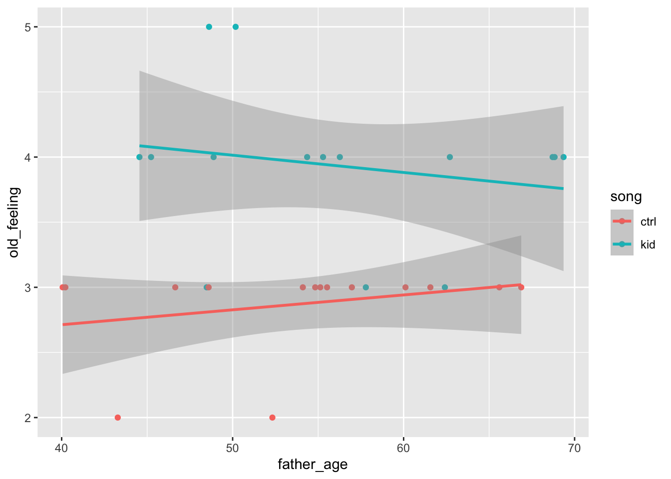
Now, let’s plot this to show how analysis of covariance (ANCOVA) might work.
Note
My graduate statistics professor, Dr. Mike Meyer, always exhorted us to “plot our data!” That is, he thought we should always plot first, then run our statistics later. I’ve taken that advice to heart in my own work.
library(tidyverse)
── Attaching core tidyverse packages ──────────────────────── tidyverse 2.0.0 ──
✔ dplyr     1.1.3     ✔ readr     2.1.4
✔ forcats   1.0.0     ✔ stringr   1.5.1
✔ ggplot2   3.4.4     ✔ tibble    3.2.1
✔ lubridate 1.9.3     ✔ tidyr     1.3.0
✔ purrr     1.0.2
── Conflicts ────────────────────────────────────────── tidyverse_conflicts() ──
✖ dplyr::filter() masks stats::filter()
✖ dplyr::lag()    masks stats::lag()
ℹ Use the conflicted package (<http://conflicted.r-lib.org/>) to force all conflicts to become errors
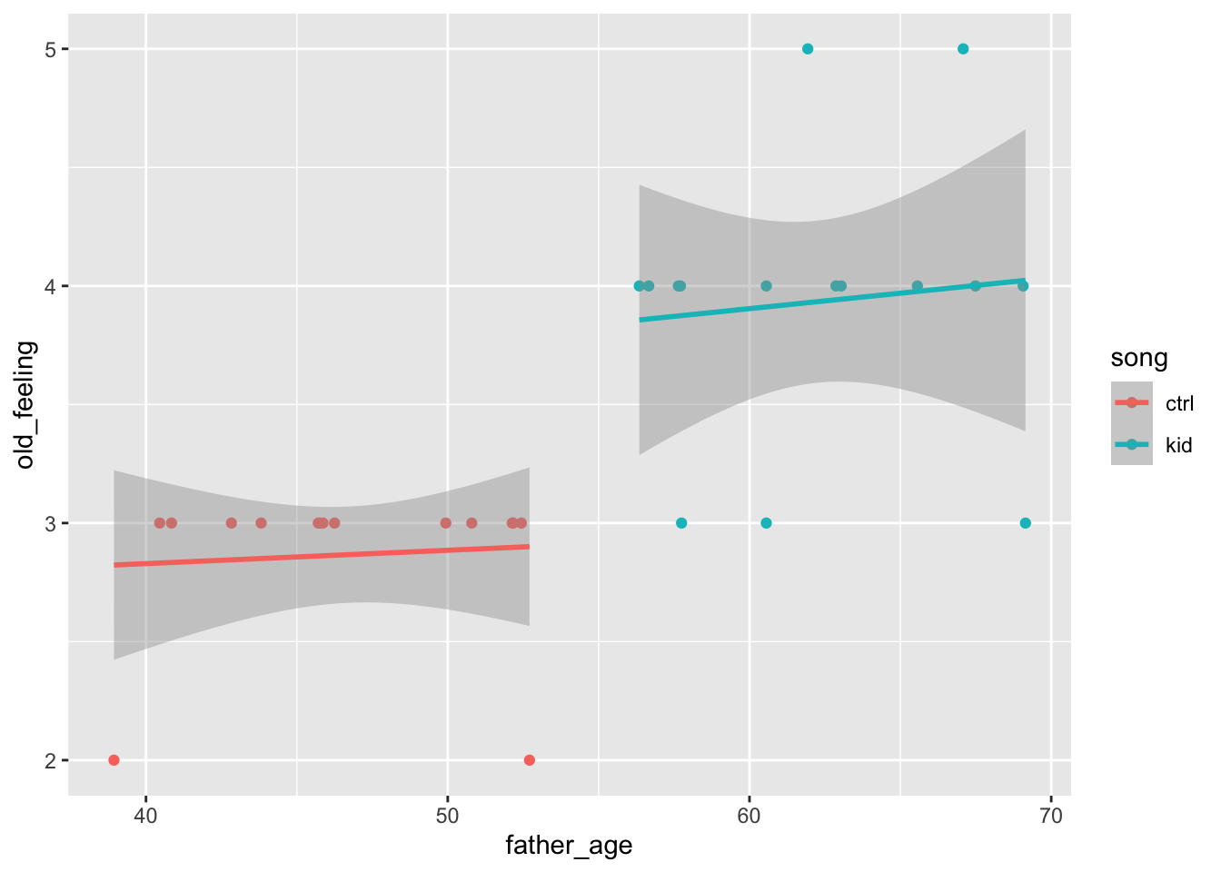
false_pos_study_1 |>ggplot() +aes(x = father_age, y = old_feeling, color = song) +geom_point() +geom_smooth(method = lm) # linear fit
This plot adds two lines to the data, one for each song group. The ANCOVA will let us evaluate whether the old_feeling is predicted by a linear combination of father_age and song.
In the code below, notice that we set formula = old_feeling ~ song + father_age. This is how we tell the aov() command that the linear combination of song and father_age are the variables we want to use to predict old_feeling.
glm_ancova <-aov(formula = old_feeling ~ song + father_age, data = false_pos_study_1)summary(glm_ancova)
            Df Sum Sq Mean Sq F value  Pr(>F)
song         1  8.533   8.533  34.576 2.9e-06 ***
father_age   1  0.003   0.003   0.012   0.913
Residuals   27  6.664   0.247
---
Signif. codes:  0 '***' 0.001 '**' 0.01 '*' 0.05 '.' 0.1 ' ' 1
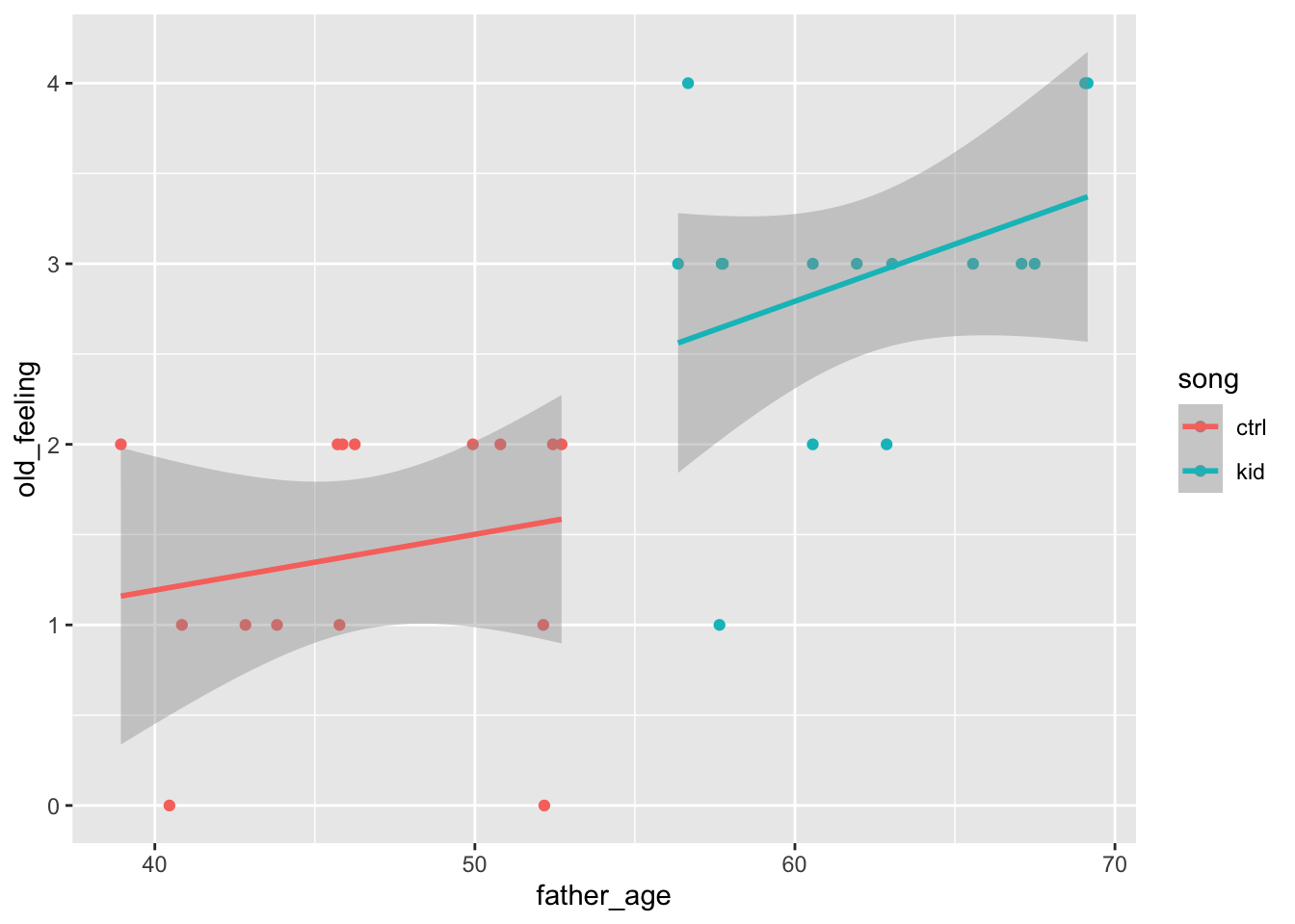
Now, let’s imagine that father_age wasn’t entirely random for some reason.
false_pos_study_1a <-data.frame(sub_id =1:30, song, father_age, old_feeling)false_pos_study_1a |>ggplot() +aes(x = father_age, y = old_feeling, color = song) +geom_point() +geom_smooth(method = lm) # linear fit
`geom_smooth()` using formula = 'y ~ x'
glm_ancova <-aov(formula = old_feeling ~ song + father_age, data = false_pos_study_1a)summary(glm_ancova)
            Df Sum Sq Mean Sq F value   Pr(>F)
song         1  8.533   8.533  34.827 2.74e-06 ***
father_age   1  0.051   0.051   0.209    0.652
Residuals   27  6.616   0.245
---
Signif. codes:  0 '***' 0.001 '**' 0.01 '*' 0.05 '.' 0.1 ' ' 1
Or, maybe worse, that how old participants’ felt related to their fathers’ age.
old_feeling <- (father_age-40)/(70-40) +rnorm(n=30, 0, 0.25)old_feeling <-round(old_feeling/(max(old_feeling)-min(old_feeling))*4+1, 0)false_pos_study_1b <-data.frame(sub_id =1:30, song, father_age, old_feeling)false_pos_study_1b |>ggplot() +aes(x = father_age, y = old_feeling, color = song) +geom_point() +geom_smooth(method = lm) # linear fit
`geom_smooth()` using formula = 'y ~ x'
glm_ancova <-aov(formula = old_feeling ~ song + father_age, data = false_pos_study_1b)summary(glm_ancova)
            Df Sum Sq Mean Sq F value   Pr(>F)
song         1 17.633  17.633  31.269 6.24e-06 ***
father_age   1  1.307   1.307   2.318     0.14
Residuals   27 15.226   0.564
---
Signif. codes:  0 '***' 0.001 '**' 0.01 '*' 0.05 '.' 0.1 ' ' 1
References
Simmons, J. P., Nelson, L. D., & Simonsohn, U. (2011). False-positive psychology: Undisclosed flexibility in data collection and analysis allows presenting anything as significant. Psychological Science, 22(11), 1359–1366. https://doi.org/10.1177/0956797611417632