Exercise 06
Making figures with ggplot2
Dates
We’ll work on this exercise in-class on March 27, 2025.
The write-up is due on Thursday, April 3, 2025.
Goals
- Create some simple figures in R using the
ggplot2package. - Gain an appreciation of the costs and benefits of scripting the generation of figures.
Assignment
Background
You may complete this assignment in two ways:
Use RStudio on your personal computer or a Penn State lab computer to write your R code and generate your figures. Then create a document with your code and generated figures.
Use Quarto on Posit.cloud.
You may find some of the explanation and code contained in this tutorial helpful.
The tutorial on making and visualizing data may also be useful.
We’ll be analyzing the survey data one of your classmates collected.
For students using Posit.cloud
Log in to Posit.cloud.
Open the
ex06assignment.Open the
exercise-06.qmdQuarto document.
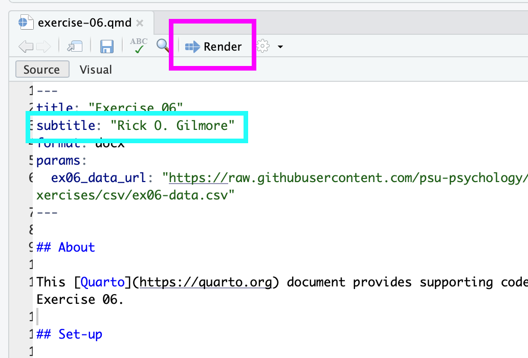
Read and follow the directions in the document. You may edit the document and save your changes. Press the ‘render’ button (magenta highlighting) to convert the Quarto source document into an MS Word output document. Make sure to change Dr. Gilmore’s name to yours (cyan highlighting).
For students not using Posit.cloud
- Download the data.
Visit the cleaned CSV file on GitHub:
Press on the download button to download the data to your computer.
- Move the downloaded file.
You’ll want to copy and paste or move the file to the working directory where RStudio loads. To find this on your computer, open RStudio and run getwd() in the console. Here is what the results of that look like on Gilmore’s computer:
Yours will differ from this. Copy your file to this directory/folder.
- Load the data into a data frame.
Run the following code in your console to load the CSV file as a data frame.
survey <- read.csv("ex06-data.csv")- Confirm that the file loaded by running the following:
str(survey)You should see something like this:
If you are struggling at this step, then it is usually because your CSV file is not in a location where RStudio can find it.
It will be much easier for us to help you if we can see you in-person (in class or in a separate meeting) or via Zoom with screen-sharing.
By all means, try to fix the problem yourself, but don’t spend hours doing so.
If you successfully downloaded the CSV and loaded it as a data frame, you’re nearly ready for the fun part(s).
- Load R packages needed to make your code simpler.
Before we load the packages, we need to install them: Run the following code:
install.packages("tidyverse")Then, to load the packages into your computer’s active memory, run the following code:
- 1
-
Loads the
dplyrlibrary. - 2
-
Loads the
ggplot2library. - 3
-
Loads the
forcatslibrary.
survey |>
  count(fav_flavor) |>
  ggplot() +
  aes(x = fav_flavor, y = n) +
geom_col()- Add colors to the bars
To do this, you’ll need to add a fill aesthetic to the aes() command. You can have ggplot assign colors automatically based on the values in some variable like fav_flavor by adding fill = fav_flavor to the list of aesthetics in the previous code. The code below is almost correct. Fix it and make a more colorful plot.
survey |>
  count(fav_flavor) |>
  ggplot() +
1  aes(x = fav_flavor, y = n, fill = ) +
geom_col()- 1
- This line is incomplete. Fix it and make the plot.
If you want all the bars to be the same color, add a fill aesthetic to geom_col().
survey |>
  count(fav_flavor) |>
  ggplot() +
  aes(x = fav_flavor, y = n) +
1 geom_col(fill = "lightblue")- 1
- Makes all of the bars a light blue. Try a different color like “orange”, or “violet”.
Try making a colorful plot of another variable like best_pet or n_concerts.
- Add order to a plot.
As a final exercise, try to make a plot that shows the bars in order based on the number of responses. Here’s a section of code that does this for the fav_flavor data.
survey |>
  count(fav_flavor) |>
1  mutate(fav_flavor_sorted = fct_reorder(fav_flavor, n)) |>
  ggplot() +
2  aes(x = fav_flavor_sorted, y = n, fill = fav_flavor_sorted) +
geom_col() - 1
-
Uses the
fct_reorder()function from theforcatspackage to create an ordered factor based onfav_flavorand the count stored inn. - 2
- Use the new sorted variable as the aesthetics in our plot.
Here we use the mutate() function to create a new variable in our data frame.
Submit
The code you wrote in following the steps above.
The results of running your code.
Comments about what you observed.


