Code
library(reticulate)
use_virtualenv("myenv", required = TRUE)Making figures with Python
This page is under construction.
It may change before the assignment is released to class.
We’ll work on this exercise in-class on Thursday, April 10, 2025.
The write-up is due on Thursday, April 17, 2025.
For reasons not especially worth explaning here, we have to use R to configure Python for making figures.
library(reticulate)
use_virtualenv("myenv", required = TRUE)Python calls groups of functions libraries. These are analogous to packages in R.
import numpy as np
import matplotlib.pyplot as plt
import pandas as pdIn Python, we use the import command.
We create ‘nicknames’ for the packages so that we can refer to them using an easy-to-type shorthand. The nicknames are the short names: … import pandas as pd, means import the ‘pandas’ library and give it the shortname of ‘pd’.
We’ll make plots of some of NSFG data we discussed in class on 2025-04-01.
The data file has been saved under ../include/csv/
The pandas library (shortname in our code pd) handles the creation and manipulation of data frames. That includes importing comma-separated value (CSV) files.
nsfg = pd.read_csv('../include/csv/NSFG_2022_2023_FemPregPUFData.csv')We confirm that this worked by checking the data types in nsfg:
nsfg.dtypesCaseID int64
PREGORDR int64
FTFMODE int64
BORNALIV float64
RECNT5YRPRG float64
...
CMJAN3YR int64
CMJAN4YR int64
CMJAN5YR int64
YEAR int64
QUARTER int64
Length: 111, dtype: objectThis is similar to running the str() function on an R data frame.
Objects in Python have specialized functions that can be used with them using a simple ‘dot’ syntax. So nsfg.dtypes means ‘run the data types function on the nsfg data frame.’ These specialized functions are called ‘methods.’
nsfg.shape(8247, 111)The shape method is similar to the dim() function in R. What do the two numbers mean?
Since we used the pandas library to import our data frame, we can use one of the built-in methods that apply to data frames to plot a histogram. Here, we create a histogram by calling the hist() method on the nsfg data frame and by specifying the column AGER, the age of the responding participant.
nsfg.hist(column = "AGER")array([[<Axes: title={'center': 'AGER'}>]], dtype=object)plt.show()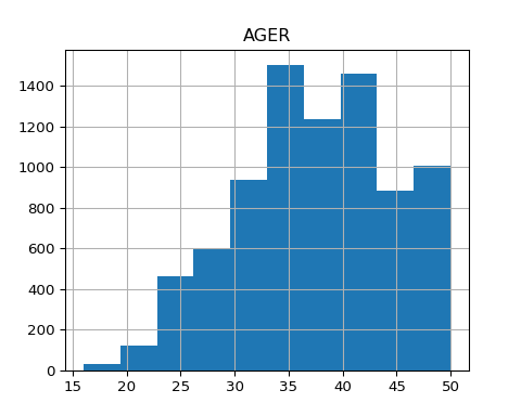
Now, let’s customize the plot by changing some parameters in the hist() method. Add change the number of bins to some larger number like 20, 25, or 30 (the default is 10), by changing LARGE_NUMBER to a different number.
LARGE_NUMBER = 35
nsfg.hist(column = "AGER", bins = LARGE_NUMBER)
array([[<Axes: title={'center': 'AGER'}>]], dtype=object)plt.show()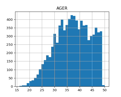
Now, try a smaller value, less than 10. Change the code below to try this.
SMALLER_NUMBER = 5
nsfg.hist(column = "AGER", bins = SMALLER_NUMBER)
array([[<Axes: title={'center': 'AGER'}>]], dtype=object)plt.show()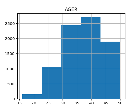
What do you notice?
Let’s look at the histograms by RELIGION, like we did in class on 2025-04-01.
nsfg.hist(column = 'AGER', by = 'RELIGION')array([[<Axes: title={'center': '1'}>, <Axes: title={'center': '2'}>],
[<Axes: title={'center': '3'}>, <Axes: title={'center': '4'}>]],
dtype=object)plt.show()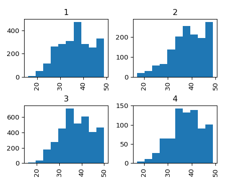
Modify the code below to create a set of histograms by some other variable that you choose (change VARIABLE_YOU_CHOOSE in the code below.) Make sure to look at the codebook to make sure that the variable you choose makes sense.
Make sure to put the variable you choose in quotations.
VARIABLE_YOU_CHOOSE = 'BABYSEX'
nsfg.hist(column = 'AGER', by = VARIABLE_YOU_CHOOSE)
array([[<Axes: title={'center': '1.0'}>, <Axes: title={'center': '2.0'}>],
[<Axes: title={'center': '8.0'}>, <Axes: title={'center': '9.0'}>]],
dtype=object)plt.show()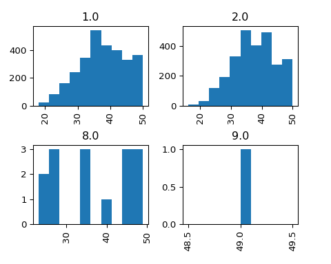
Finally, experiment with changing some of the default parameters like grid (values can be True or False), xrot (rotation of x axis labels) or yrot (rotation of y axis labels).
MY_XROT = 0
nsfg.hist(column = 'AGER', by = 'RELIGION', xrot = MY_XROT)
array([[<Axes: title={'center': '1'}>, <Axes: title={'center': '2'}>],
[<Axes: title={'center': '3'}>, <Axes: title={'center': '4'}>]],
dtype=object)plt.show()
What do the numbers for age represent? Consult the codebook for clues.
Finally, try to modify the code below to make a plot focusing on variables of your own choosing.
You’ll need to edit plottype, MAIN_VARIABLE, and possibly by = RELIGION.
You will also need to change eval: false to eval: true to evaluate the code and generate the figure.
nsfg.plottype(MAIN_VARIABLE, by = 'RELIGION')
plt.show()The code you wrote in following the steps above.
The results of running your code.
Answers to the questions about the figures and comments about what you observed.