Findings: Data viz outside psych sci

Published

February 20, 2025

Modified

January 29, 2025

About

This page extracts information about the data visualizations we explored in Exercise-02 from the shared Google Sheet.

Google Sheet

Direct link: https://docs.google.com/spreadsheets/d/1rLiLBRbDQfInauOUBPNwGYq-0VOjskGNY7Wq2QRTTbc/edit?gid=0#gid=0

Preparation

First, we load the external packages (groups of R commands) that we will be using.

Important

The code uses the quietly() function from the purrr package to suppress most of the feedback.

Code
library('ggplot2')
library('dplyr')

r_functions <- list.files(file.path(here::here(), "src", "R"), "\\.R$", full.names = TRUE)

purrr::map(r_functions, source) |>
  purrr::quietly()
function (...) 
capture_output(.f(...))
<bytecode: 0x107706c88>
<environment: 0x1077069b0>

Gathering

Next, we download the data from the Google Sheet where it is collected. Dr. Gilmore has stored his Google account credentials in a special environment file that can be accessed by the R command Sys.getenv("GMAIL_SURVEY").

Tip

It’s vital to be very careful when creating and sharing code like this that involves sensitive information like login credentials.

Gilmore likes to put credentials in an .Renviron file that lives in his home directory. This is a recommended practice. On Mac OS and Linux, that’s ~/.Renviron. You can use the usethis::edit_r_profile() command at the R console (not the Terminal) to open your own .Renviron file. In Gilmore’s case, he has added the following line to that file:

GMAIL_SURVEY="<my-google-account>"

Here, he has substituted his Google account with credentials/access to the required files for <my-google-account>. Then, when the R code below calls Sys.getenv("GMAIL_SURVEY"), the value of those credentials is returned as a text string.

Make sure to close and save the .Renviron file and restart your R session before testing this yourself.

Code
if (!dir.exists('csv')) {
  message("Creating missing `csv/`.")
  dir.create("csv")
}

if (params$update_data) {
  options(gargle_oauth_email = Sys.getenv("GMAIL_SURVEY"))
  googledrive::drive_auth()

  googledrive::drive_download(
    "PSYCH-490.003-Spr-2025-Biz-Govt",
    path = file.path("csv", params$fn),
    type = "csv",
    overwrite = TRUE
  )
  message("Data updated.")
} else {
  message("Using stored data.")
}

The data file has been saved as a comma-separated value (CSV) format data file in a special directory called csv/.

Note

Because these data might contain sensitive or identifiable information, we only keep a local copy and do not share it publicly via GitHub. This is achieved by adding the name of the data directory to a special .gitignore file.

Cleaning

Next we load the saved data file, and then proceed to clean it.

Code
ex02 <-
  readr::read_csv(file.path("csv", params$fn), show_col_types = FALSE)

There are 46 responses.

These are the column/variable names.

Code
# Google Forms puts the full question in the top row of the data file.
# We use the names() function to extract and print the original questions.
ex02_qs <- names(ex02)
ex02_qs
[1] "identifier"    "source_type"   "url_to_src"    "url_to_figure"
[5] "why_selected"  "comment"      

For simplicity, we visualize below only those with non-empty URLs to the specific figure.

Summary data

Code
figs_w_urls <- ex02 |>
  filter(!is.na(url_to_figure))

There were n=14 unique respondents.

Of the 46 responses from these individuals or teams, n=27 had URLs we could link to directly.

Figures found

Code
these_figs <- ex02 |>
  filter(!is.na(url_to_figure))

res <- invisible(lapply(1:dim(these_figs)[1], return_img_chunk, df = these_figs))
cat(unlist(res), sep = "\n")

Figure 1

Source: https://wpdatatables.com/sports-data-visualization/#:~:text=What%20is%20Sports%20Data%20Visualization,drawn%20from%20sports%2Drelated%20data.

Analyst Source Type Why Selected
Kmm Report Basketball Fan
Comments
NA

Figure 2

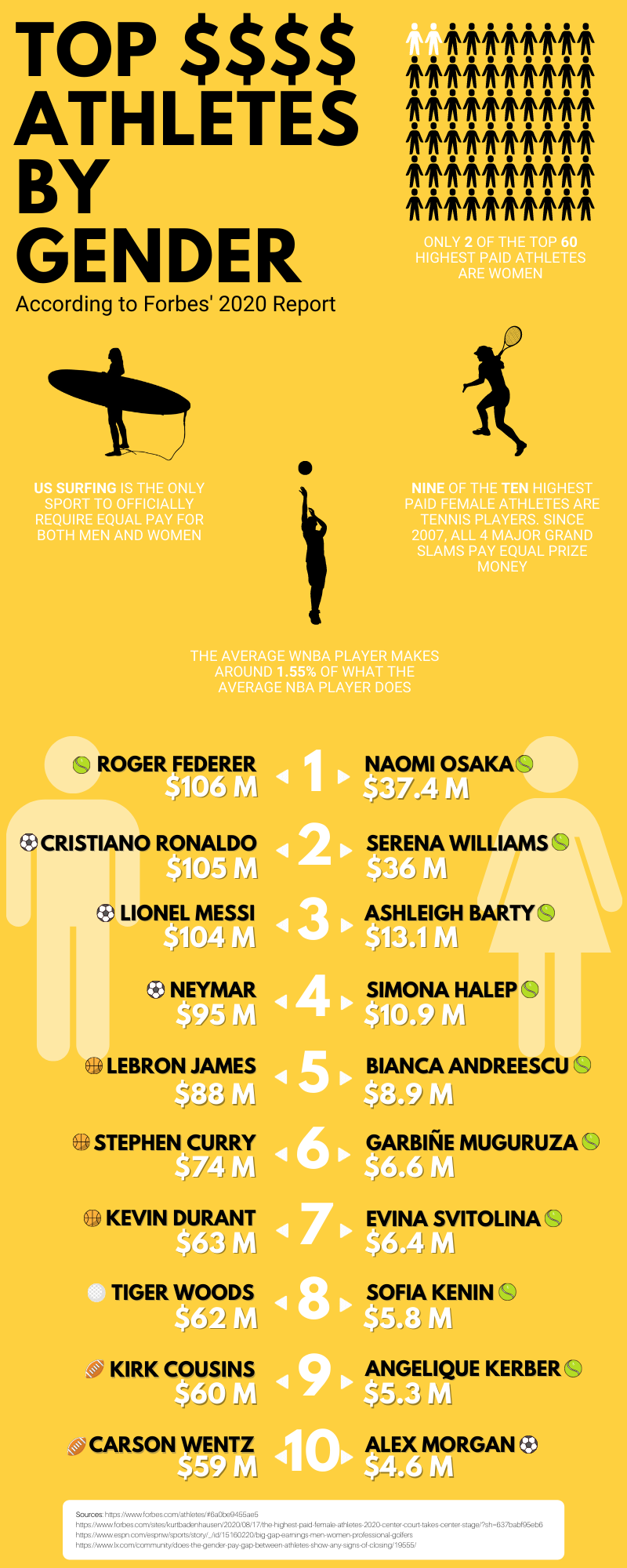
Source: https://kinesiology.csp.edu/sports-coaches-and-trainers/infographic-top-paid-athletes-by-gender/?nab=1

Analyst Source Type Why Selected
Kmm article This image breaksdown a few different types of sport business issues in regard to male vs female salary in sport.
Comments
Graphic

Figure 3

Source:

Analyst Source Type Why Selected
ayc1 Poster Seen in person
Comments
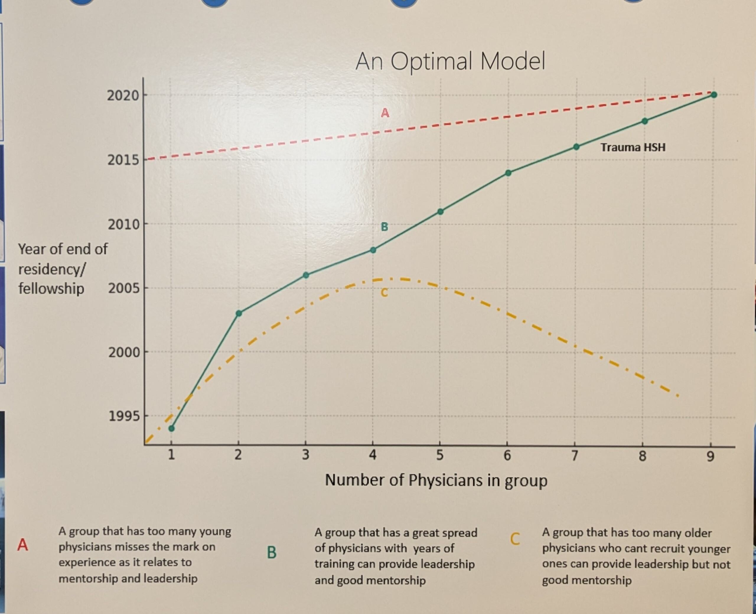
Number of physicians by resident year in a hospital department

Figure 4

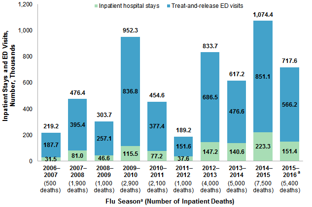
Source: https://hcup-us.ahrq.gov/reports/statbriefs/sb253-Influenza-Hospitalizations-ED-Visits-2006-2016.jsp

Analyst Source Type Why Selected
ayc1 Report Public health/medical example
Comments
NA

Figure 5

Source: https://www.bruinsportsanalytics.com/post/growth-of-nwsl

Analyst Source Type Why Selected
ayc1 Article NWSL fan
Comments
NA

Figure 6

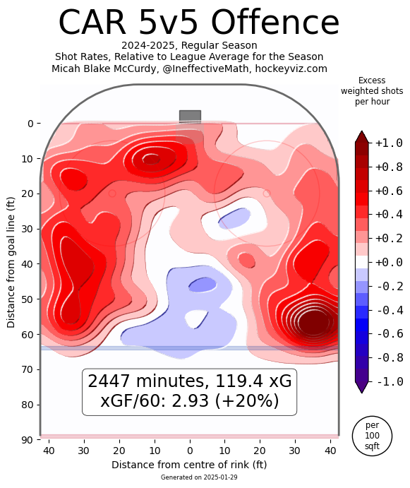
Source: https://www.hockeyviz.com/team/CAR/2425

Analyst Source Type Why Selected
ayc1 Website NHL, Canes fan
Comments
NA

Figure 7

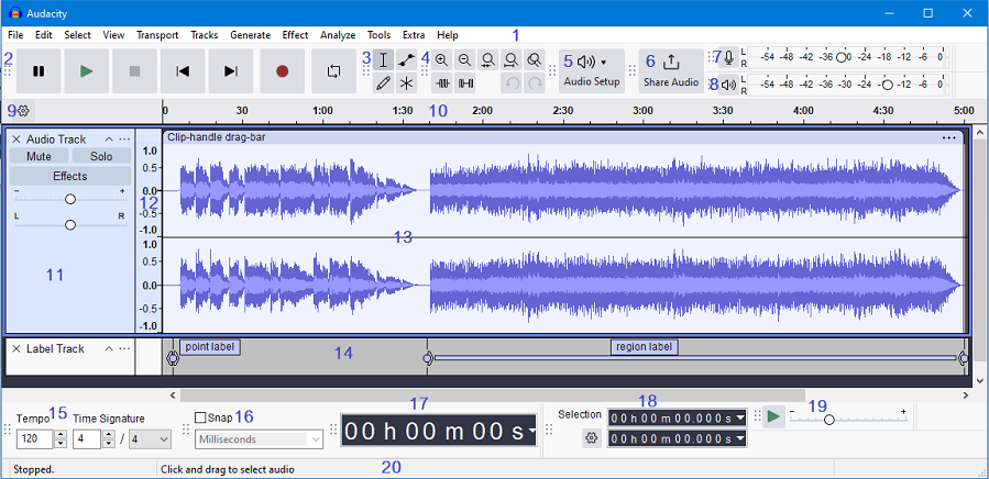
Source: https://manual.audacityteam.org/

Analyst Source Type Why Selected
ayc1 Website Visualization of sound data
Comments
NA

Figure 8

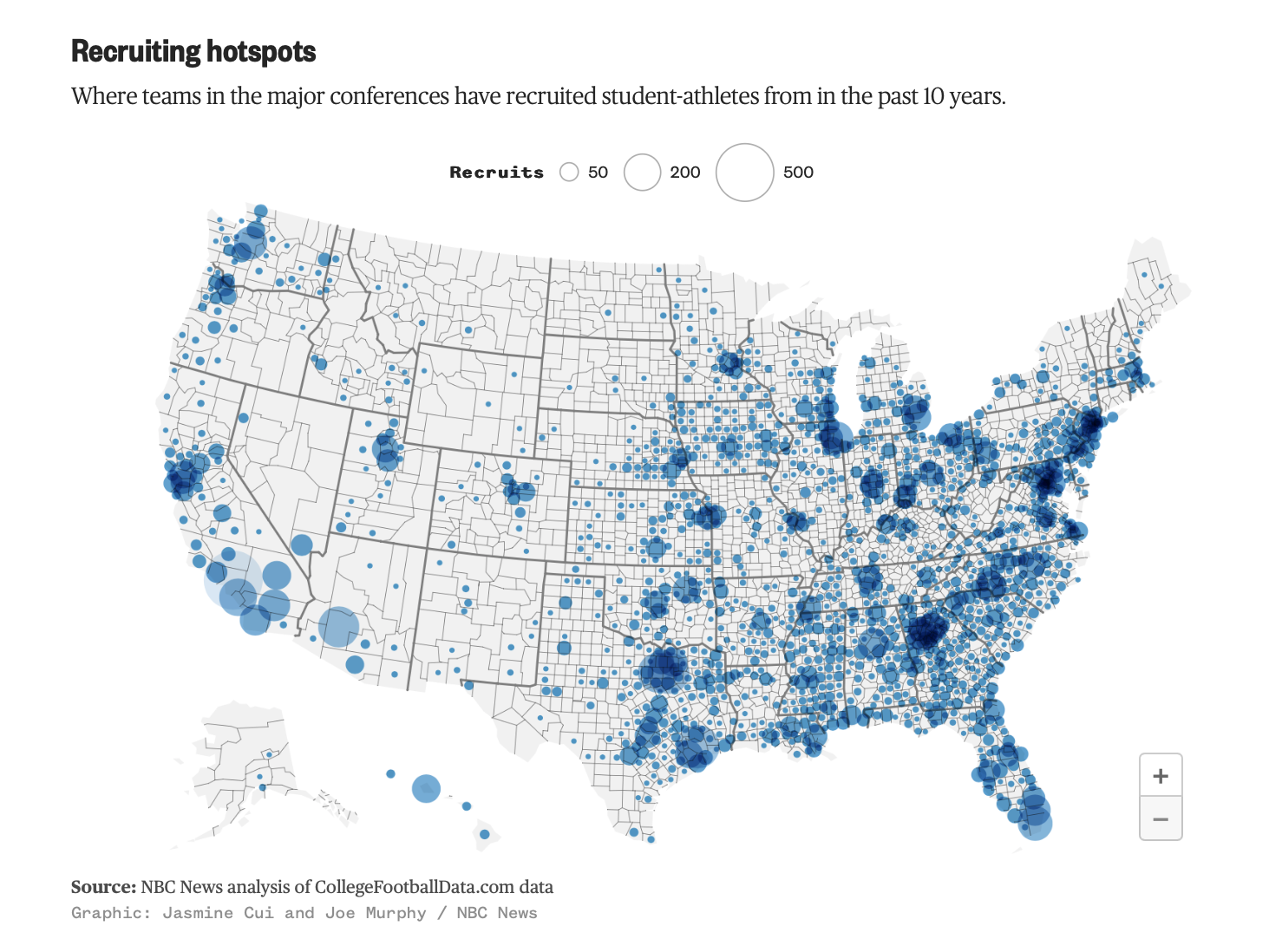
Source: https://www.nbcnews.com/data-graphics/2023-college-football-season-data-6-maps-charts-rcna102444

Analyst Source Type Why Selected
ses1 Article I am very interested in college sports and I found this graphic very interesting and easy to comprehend
Comments
Locations of student-athlete recruits for the major athletic conferences in the past 10 years

Figure 9

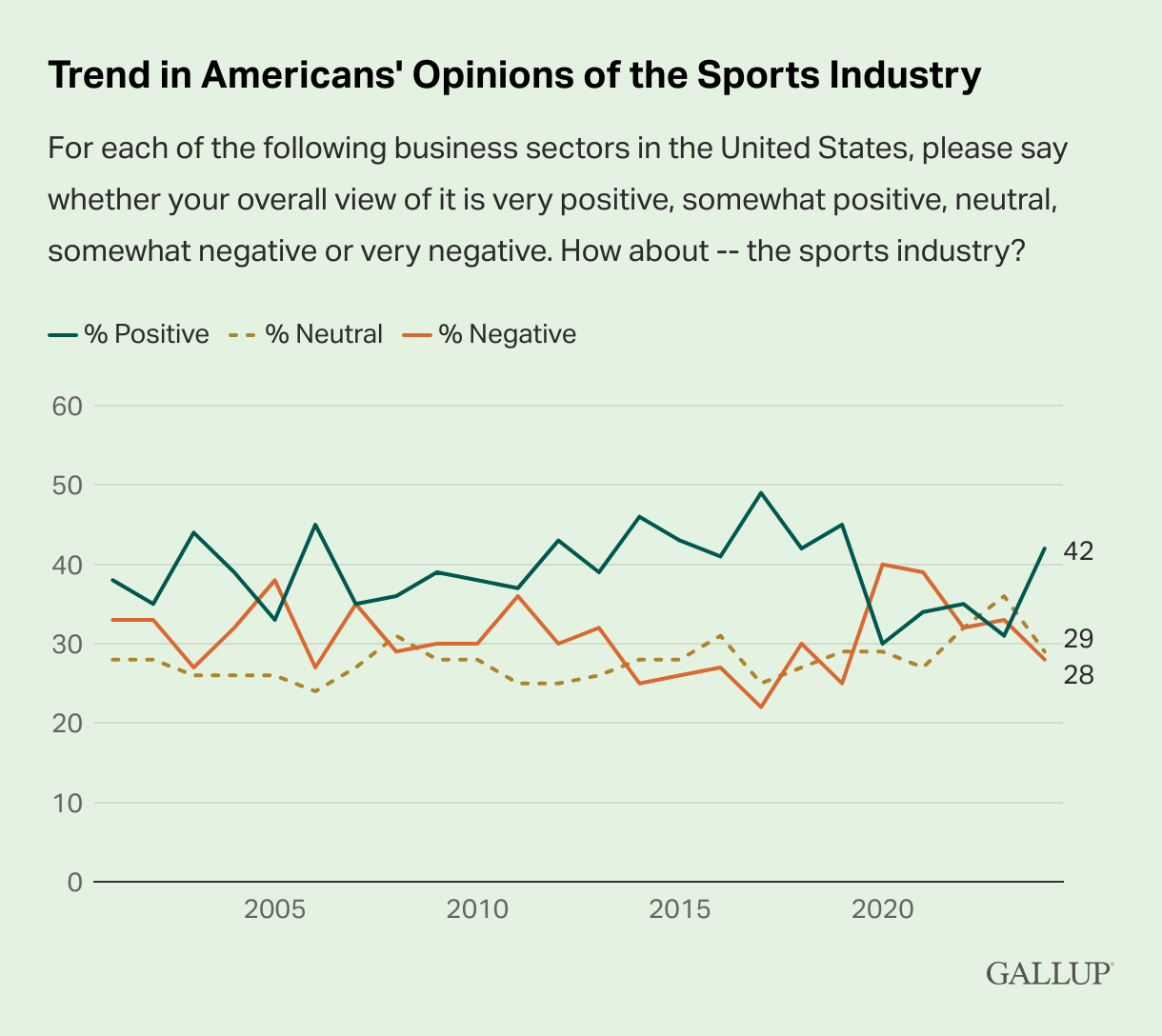
Source: https://news.gallup.com/poll/650318/grocery-restaurant-industry-images-slide.aspx

Analyst Source Type Why Selected
ses1 Article I thought this was an interesting trend to map, especially because sports appear to be a large part of American entertainment culture
Comments
American’s overall opinions of the sports industry from 2001-2024

Figure 10

Source: https://informationisbeautiful.net/beautifulnews/595-childrens-lives-saved/

Analyst Source Type Why Selected
ses1 Infographic I thought this was very visually appealing yet provided a lot of useful information
Comments
Number of children’s lives saved in varying regions over the last 25 years

Figure 11

Source: https://petapixel.com/2019/10/01/photos-of-endangered-species-where-every-pixel-represents-one-animal/

Analyst Source Type Why Selected
ses1 Digital Art Sea turtles are my favorite animal, but I thought this was a very interesting way to use digital art to bring awareness to endangerment
Comments
Digital image made of pixels correlating to how the number of animals left in the population

Figure 12

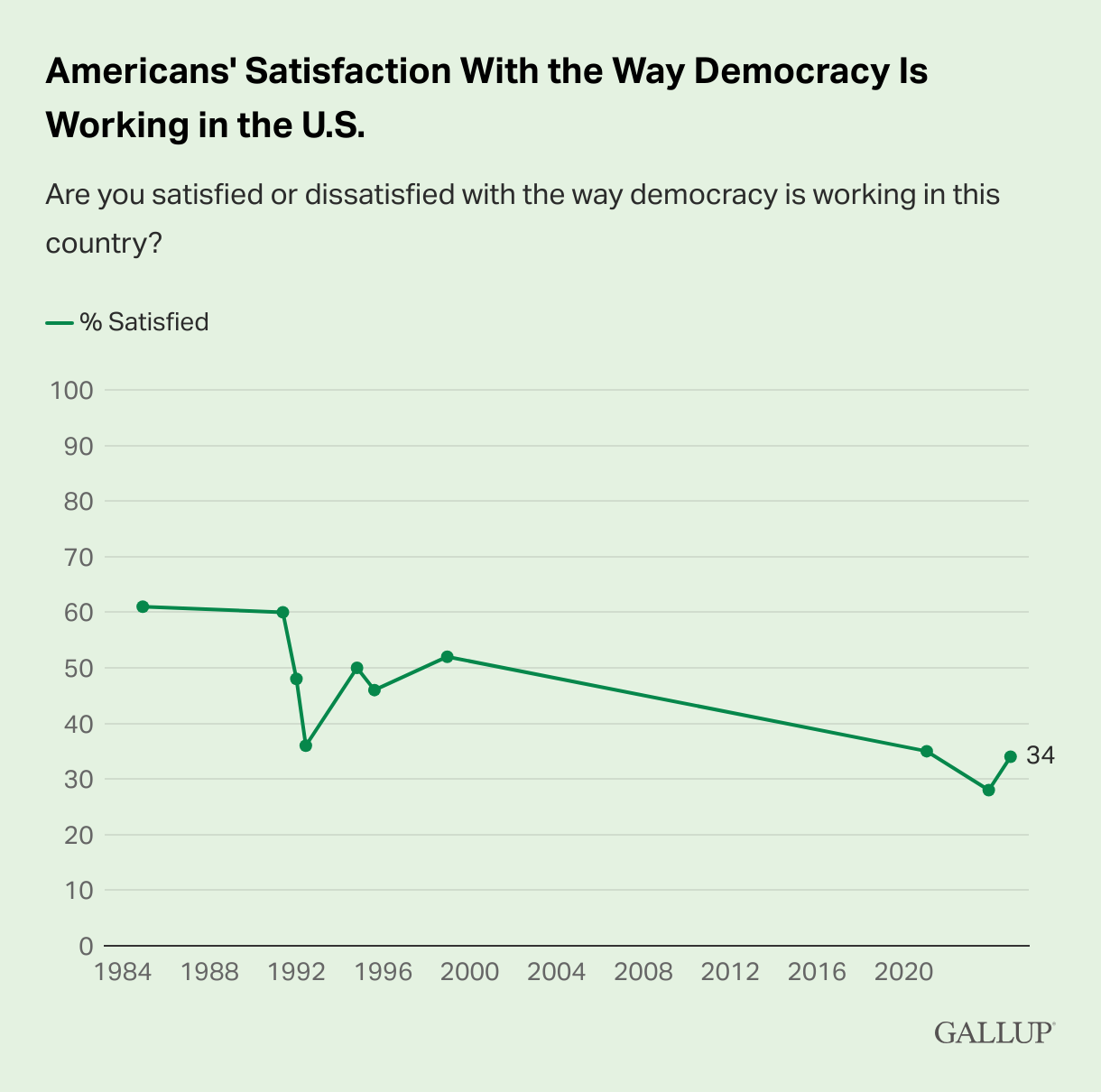
Source: https://news.gallup.com/poll/655220/satisfaction-democracy-edges-record-low.aspx

Analyst Source Type Why Selected
ses1 Article Especially after the election and inauguration day, this trend is interesting to me
Comments
Percentage of Americans satisfied with the way democracy is working

Figure 13

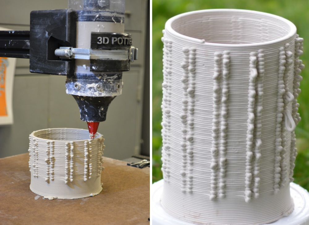
Source: https://osf.io/preprints/osf/3nyrq

Analyst Source Type Why Selected
apl1 3D Art I like 3D Art and I liked how the data was visualized in this example, it shows how varied it can be
Comments
NA

Figure 14

Source: https://www.epa.gov/outdoor-air-quality-data/air-data-daily-air-quality-tracker

Analyst Source Type Why Selected
pp website NA
Comments
NA

Figure 15

Source: https://fivethirtyeight.com/features/how-mapping-shots-in-the-nba-changed-it-forever/

Analyst Source Type Why Selected
mec article The figure lays out a clear image of field shots paired with percentages
Comments
sports

Figure 16

Source: https://journals.sagepub.com/doi/full/10.3233/THC-231875

Analyst Source Type Why Selected
mec journal The figure shows their methods through images of demonstrations
Comments
sports

Figure 17

Source: https://www.nature.com/articles/s43247-023-00856-9

Analyst Source Type Why Selected
mec article Figure 3 shows comparisons of negative and positive emotions tied to treatment groups in a simple way
Comments
art

Figure 18

Source: https://pmc.ncbi.nlm.nih.gov/articles/PMC8639497/

Analyst Source Type Why Selected
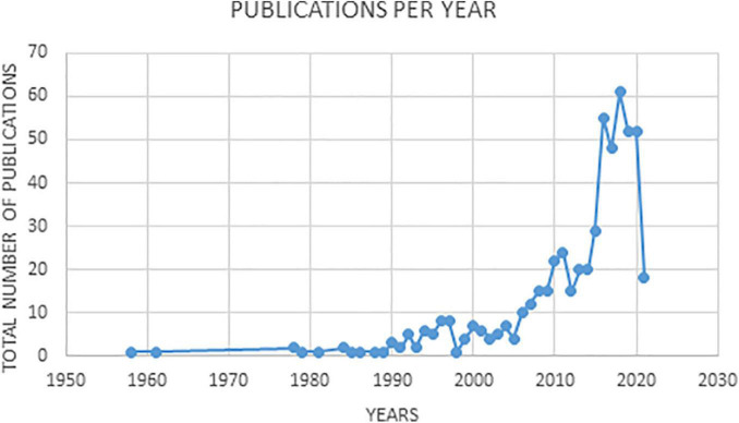
mec article Figure shows an easy to read graph showing data of publications per year
Comments
art

Figure 19

Source: https://zapier.com/blog/pandemic-business-boom-report/

Analyst Source Type Why Selected
mec article Chart shows the importance of the pandemic when it comes to an explanation for the rise of businesses
Comments
business

Figure 20

Source: https://www.businessinsider.com/17-charts-that-show-just-how-scary-amazons-275-billion-business-really-is-2016-3#its-also-the-top-seller-for-personal-care-and-beauty-products-in-the-us-5

Analyst Source Type Why Selected
mec article Chart shows the stats on how amazon exceeds other sellers specifically for beauty products and personal care
Comments
business

Figure 21

Source: https://impact.economist.com/perspectives/health/addressing-recurrent-cardiovascular-events-asia-pacific

Analyst Source Type Why Selected
zw website NA
Comments
NA

Figure 22

Source: https://impact.economist.com/perspectives/technology-innovation/putting-iot-work-business-operations

Analyst Source Type Why Selected
zw website NA
Comments
NA

Figure 23

Source: https://ygoprodeck.com/tournament/richmond-wcq-regional-2626

Analyst Source Type Why Selected
ss Website I play Yugioh, so that’s why I chose the graph
Comments
I find the choice to use a Pie chart to represent proportion of decks used to be interesing, as compared to a bar chart for frequency

Figure 24

Source: https://www.census.gov/construction/nrs/current/index.html

Analyst Source Type Why Selected
ss Website The census beuaru collects a lot of data, so i felt they’d be a great source to look ino.
Comments
NA

Figure 25

Source: https://www.iea.org/data-and-statistics/charts/installed-nuclear-power-capacity-by-country-and-age-in-advanced-economies-end-2023

Analyst Source Type Why Selected
ss Website I’m really interested in Nuclear power, and did a research project on it, so I wanted to include something on it. And this bar graph shows that the US still leads in Nuclear Power production
Comments
NA

Figure 26

Source: https://thecuriousprofessor.com/2019/12/14/visualizing-data-through-art-2/

Analyst Source Type Why Selected
abc website The visual shows a scarf knitted, with each row shows the temperature of the day
Comments
NA

Figure 27

Source: https://thecuriousprofessor.com/2019/12/14/visualizing-data-through-art-2/

Analyst Source Type Why Selected
abc website The visual shows the sleep pattern of baby, showsing the wake time and sleep time
Comments
NA